Seng Hork
Brief
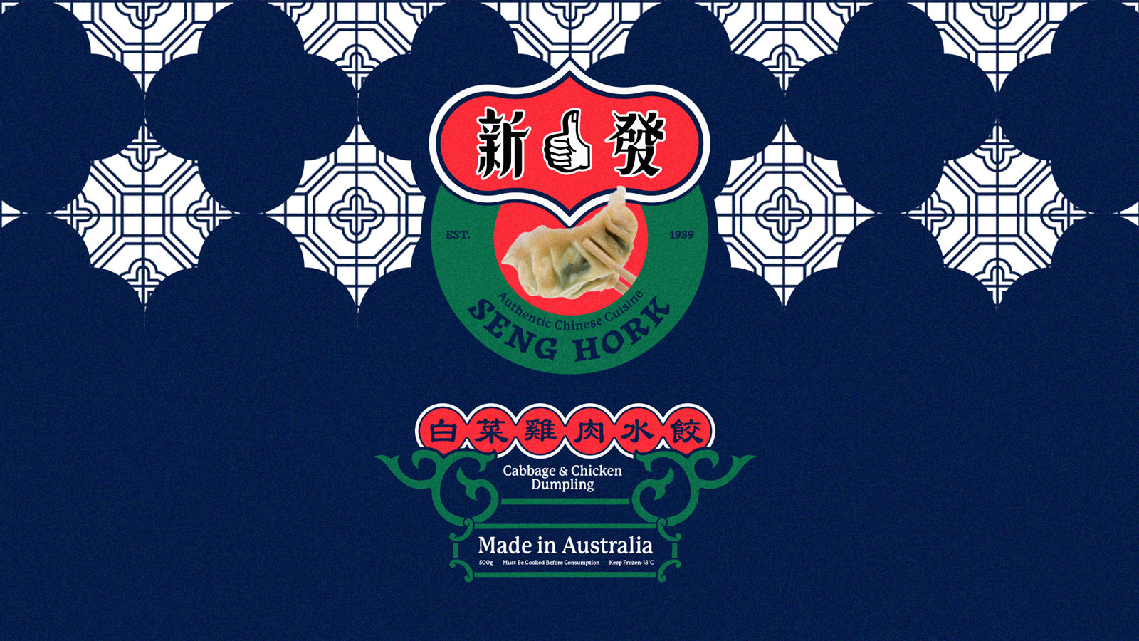
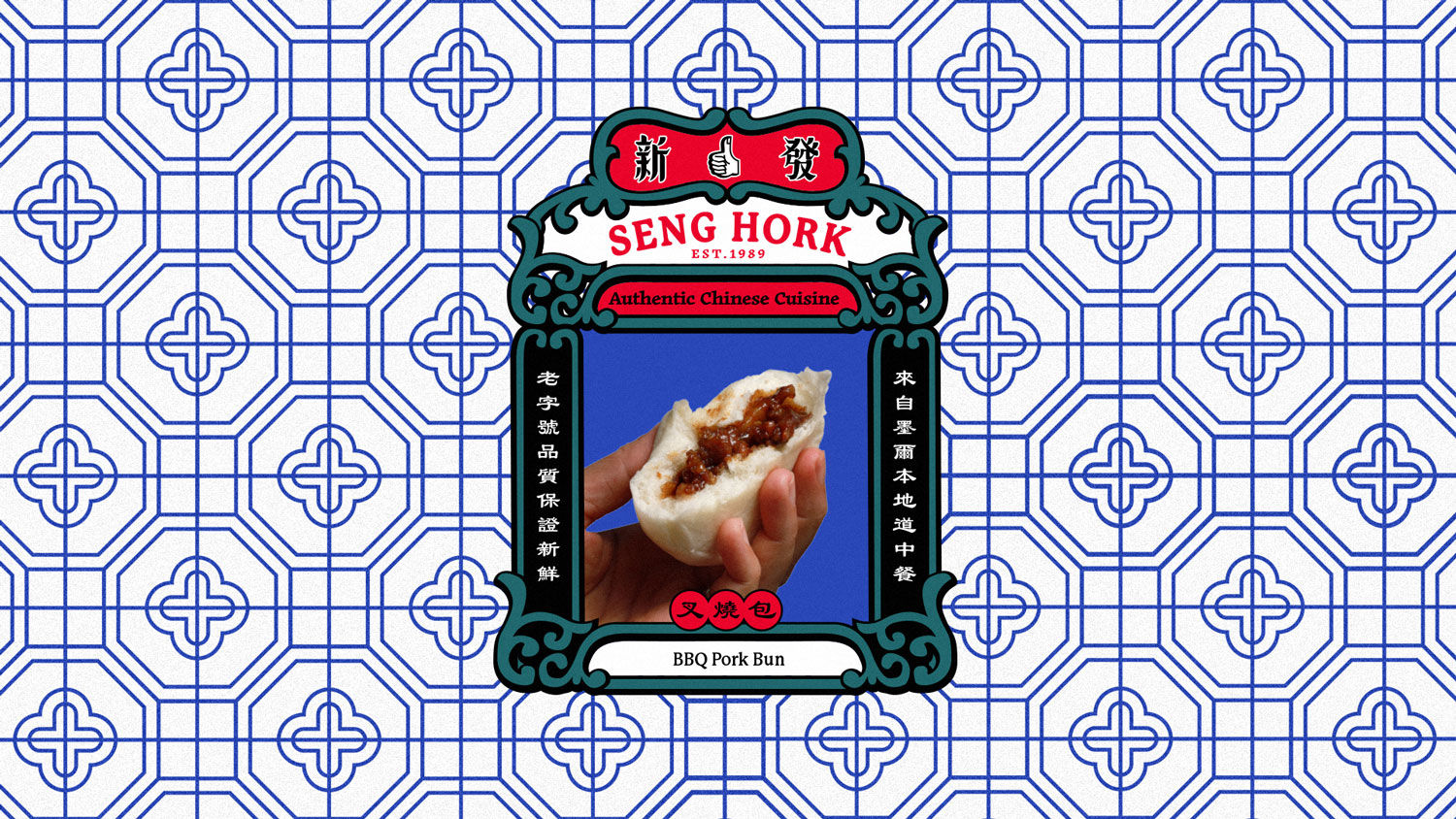
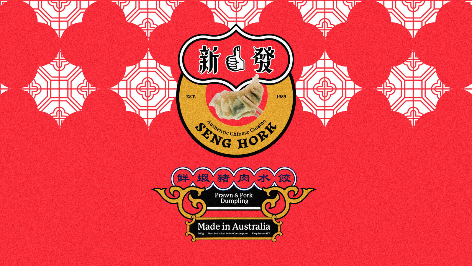
Seng Hork Authentic Chinese Food is one of the biggest frozen pastry manufacturers in Australia. They asked us to refresh their brand and packaging for a wider audience.
In this concept, we want to go back to the original inspiration that shaped Seng Hork’s aesthetics, and many of its peers. Doing so will let us assert trust and show our longevity in the market as a key differentiator to our competitors.
To do this, we’ll find inspiration from a specific place in history: the 1930s in Guandong, Hong Kong and cities across China’s coastal fringe. This is a time where Chinese traditions and urban lifestyles met with the tools and trends of early industry. In these early days of industrialization, the role of romance of craft were incorporated into everyday aesthetics of manufactured goods. A particular aesthetic style for packaging of daily consumables emerged that has stirred nostalgia ever since.
This design carries links to Chinese traditions and pre-dates communist iconography. It saw a fresh and confident translation of tradition into lockups, printing, and illustrations that were used in everyday products.
Scope
Rebranding & Strategy
Creative Direction
Creative Direction
Packaging Design


