Ripple
Brief
Ripple is a platform to help all young Australians impact the things they care about. It curates advice, experiences, and opportunities that span personal development, civic engagement, peer-to-peer support, and paid employment.
Studio Chenchen was engaged to help Ripple take their business to the next level by completing a comprehensive re-brand to match a pivot to a new strategy and a shift to an online platform. Informed by rapid and bespoke research, we helped Ripple to identify, communicate, and express who they are and what makes them special.
Studio Chenchen was engaged to help Ripple take their business to the next level by completing a comprehensive re-brand to match a pivot to a new strategy and a shift to an online platform. Informed by rapid and bespoke research, we helped Ripple to identify, communicate, and express who they are and what makes them special.
Scope
Branding & Strategy
Creative Direction
Illustration
Creative Direction
Illustration
Animation
Copywriting
Copywriting
Website

SHAPE YOUR FUTURE.


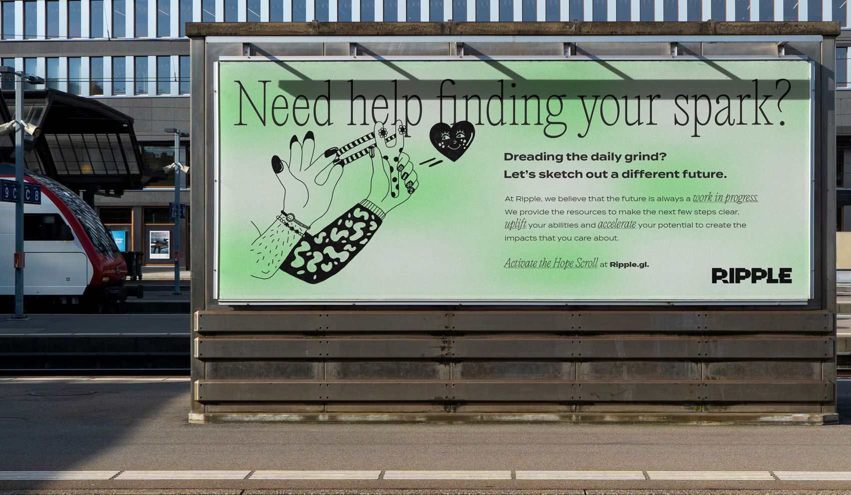
Our brand concept focuses on the idea that our Future is Sketched in Pencil. This reflects Ripple’s core position and modality for action. We combined this concept with a clear personality, identified through workshops with the client team. The re-brand builds on what was already working and repoints it for the future.


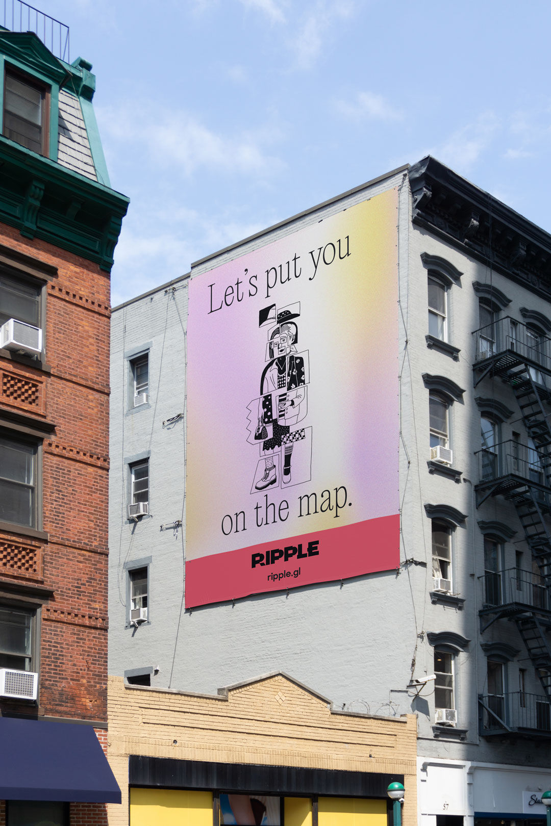
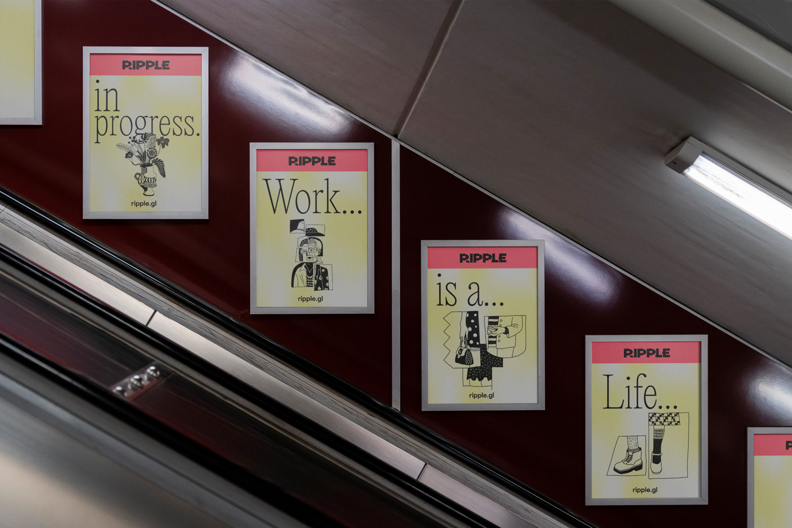
The outcome is a consistent and coherent brand system in a deliberate architecture that asserts itself with confidence.
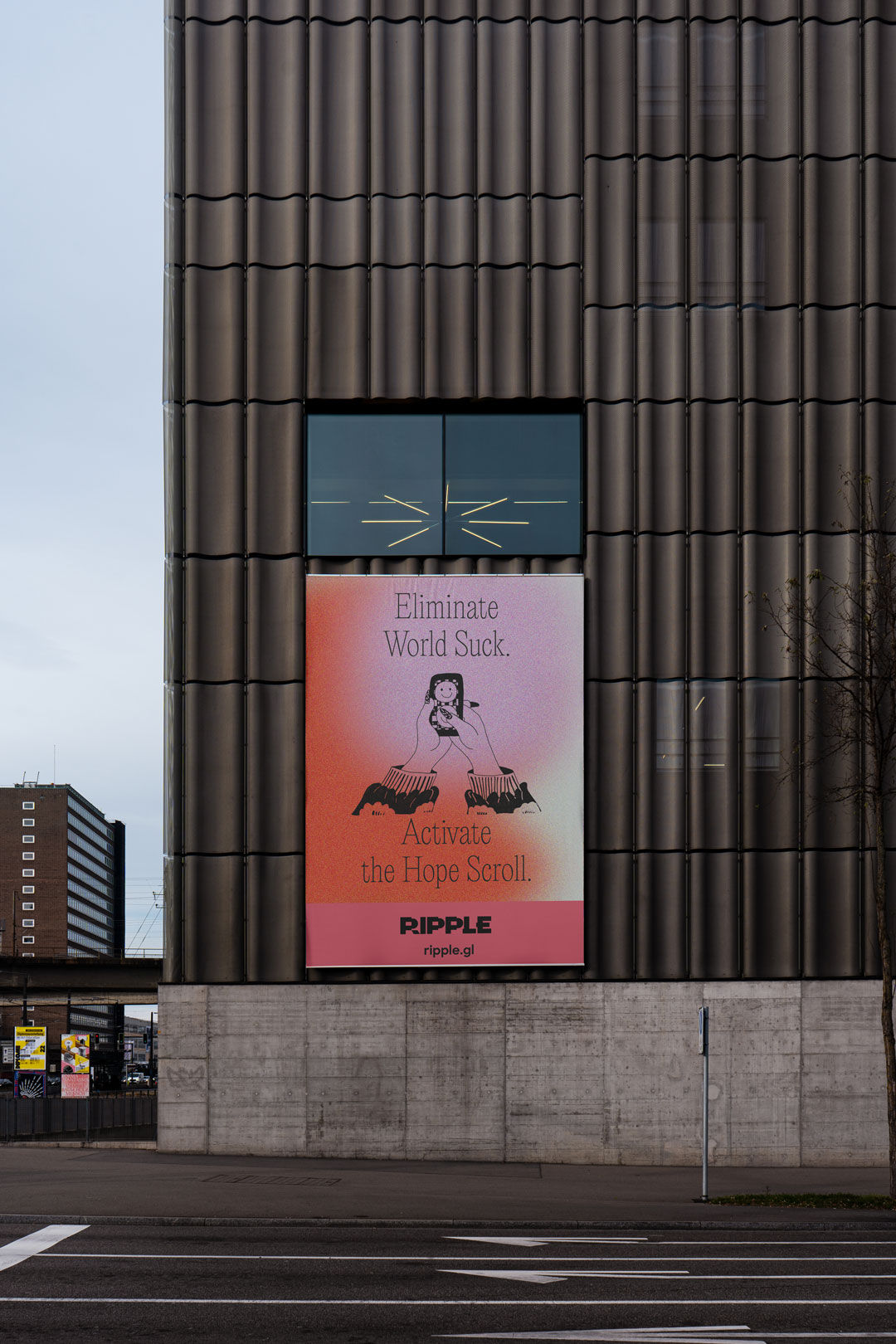
We identified an overarching set of messages that communicate Ripple’s central mission. Four illustrated icons were created to represent the different pillars of their platform.
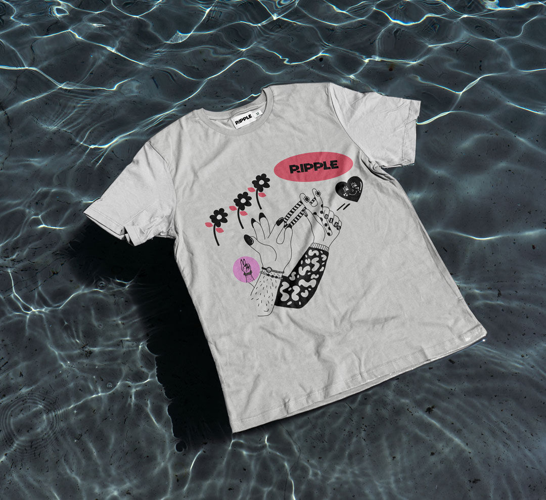
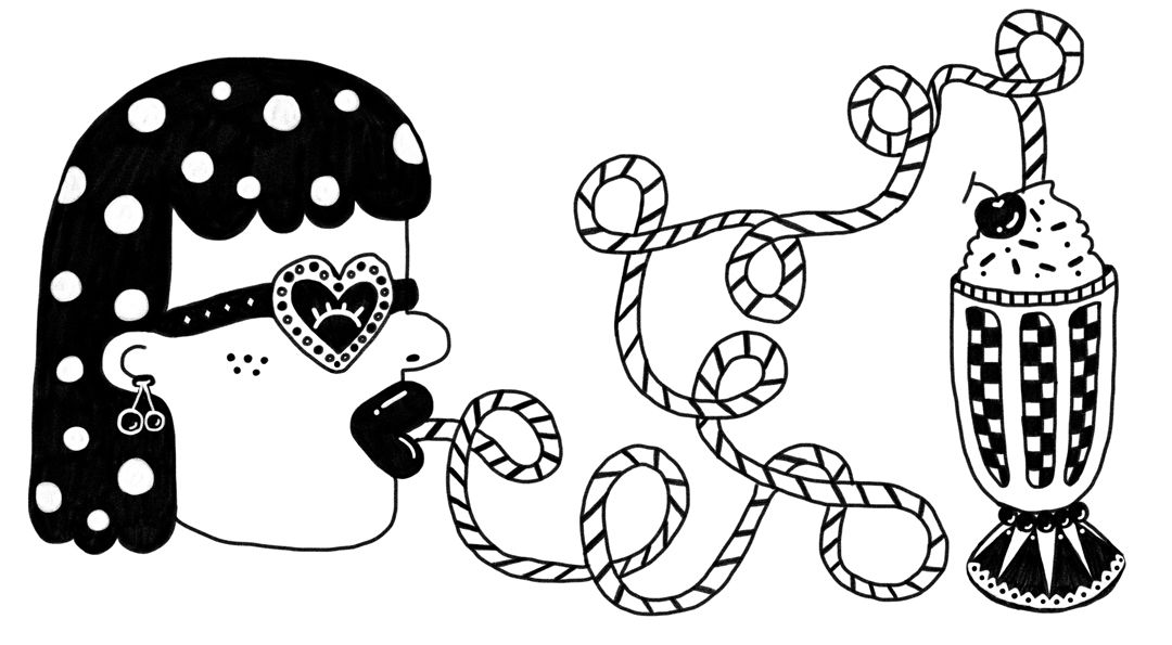
To complete the brand system, we designed a series of semiotic styles, bespoke emojis, digital animations, and a colour palette that skews the brand’s appeal to a youthful, open-minded audience and establishes a visual language that will suit a digitally-focused business. This reflects that Ripple is made from and for its community.




We also worked as a creative partner to ideate future applications that can bring the brand and Ripple’s mission to life– including podcast and social media campaigns, as well as digital devices, such as a Random Hope Generator, that can add interactivity and personality to their emerging digital platform.


