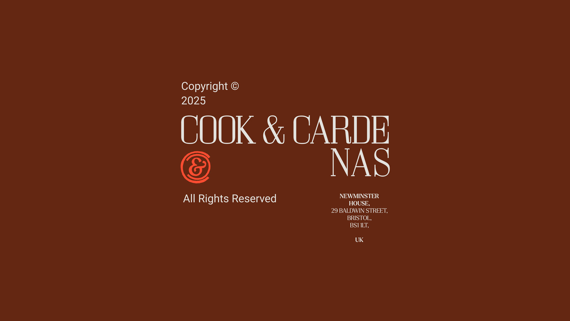
Cook & Cardenas
Brief
Cook & Cardenas came to us for a comprehensive suite of branding and design services.
We applied our brand strategy process to identify a unique and authentic positioning, creating clarity about the brand’s personality, core messages and appeal. From this, we re-named the business and developed a comprehensive brand identify across print and digital assets, with brand guidelines covering social media through to photography.
We applied our brand strategy process to identify a unique and authentic positioning, creating clarity about the brand’s personality, core messages and appeal. From this, we re-named the business and developed a comprehensive brand identify across print and digital assets, with brand guidelines covering social media through to photography.
Scope
Branding & Strategy
Creative Direction
Illustration
Naming
Creative Direction
Illustration
Naming
Website Design & Development
Social Media Design
Photography
Social Media Design
Photography
Website
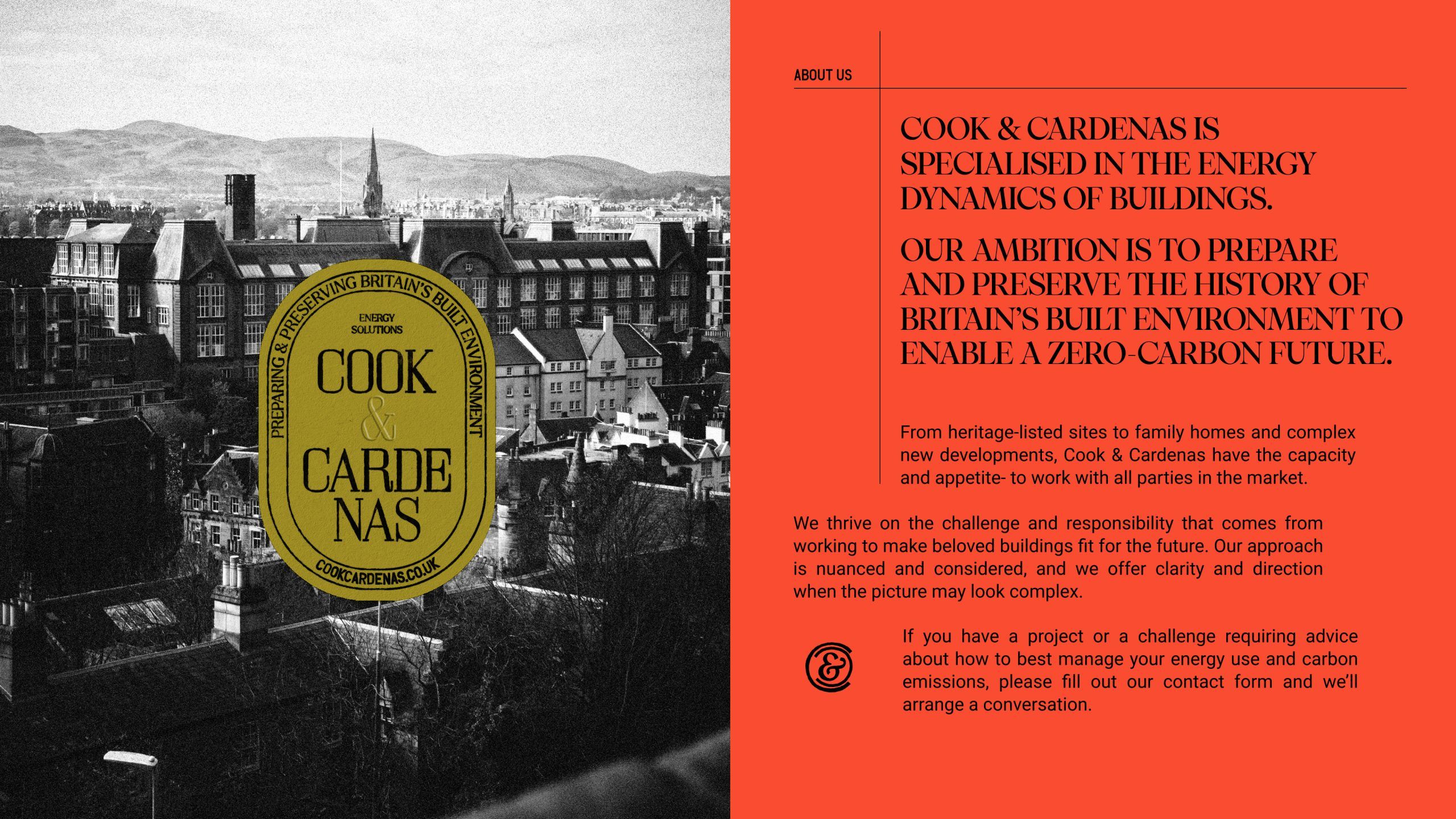
Prepare & Preserve
A hard-earned legacy of
resilience & renewal
The soul of the brand and its visual design is anchored by the company’s aspiration to help prepare and preserve Britain’s built environment to take the net zero transition in its stride. This positioning is nuanced– it has one eye on the future, mobilising cutting-edge technologies and concern with the environment. The other eye, however, is firmly and lovingly concerned with the past– an ode to the hard-earned legacy of resilience and renewal that is embodied in British aesthetics, materiality, and traditions. We captured this unique set of values and the approach that Cook & Cardenas carry into their work in a simple but telling chart.
The business was founded by Andy and Mauricio, classmates and energy specialists with complementary expertise. Aesthetically and semantically, we connected the brand to classic hallmarks of the British firm; a confident claim of quality that rests on the surname of its founders. Confidence continues in the visuals: balancing the old and the new, the historical and the contemporary.
This is achieved by elements such as the classic master logo alongside a playful set of crests, a pop of colour and the use of animation alongside structural layouts, integrated with typography.

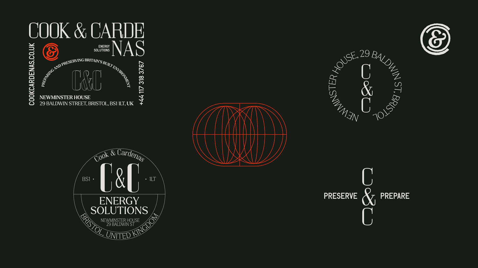


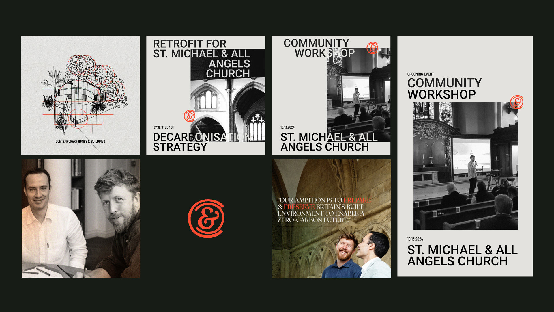


Throughout the final brand system, the copywriting and design seek to express expertise and care. Deliberate decisions are expressed alongside tactility and texture to reference the patina of weather-worn and organic materials. Hand-drawn sketches are used to illustrate common architectural forms that they work with, and abstract icons are developed to communicate different types of services.