Stappa
Brief
Stappa sources interesting and obscure grape varietals from across Australia to make delicious wine in West Melbourne. Dan is the real deal and he wants to showcase Australian wine at its best: he makes amazing wine without the baggage. Stappa’s niche is to source uncommon and under-recognised grapes to create fun and interesting wines for a young and open-minded market.
Dan came to us to create a brand and associated collateral to help them to stand out in a way that is authentic, engaging, and communicates Stappa’s points of difference.
Dan came to us to create a brand and associated collateral to help them to stand out in a way that is authentic, engaging, and communicates Stappa’s points of difference.
Scope
Branding & Strategy
Creatie Direction
Illustration
Tone of Voice & Copywriting
Creatie Direction
Illustration
Tone of Voice & Copywriting
Activation & Engagement
Social Strategy
Social Media Design
Print & Product (Merch, product, packaging)
Social Strategy
Social Media Design
Print & Product (Merch, product, packaging)
Website

Brand Strategy & Identity
We loved Stappa’s vision and perspective on the industry, and Dan’s approach to wine was both refreshing and authentic. Through a collaborative strategy and concept development process, we helped Stappa to identify its niche and identify an authentic personality to match.
The brand concept, Grapes, Dirt and Gusto, brings a no-nonsense commitment to wine that celebrates a love for craft and quality but does away with dogma and pretence.
Stappa is to wine like Ernest Hemingway is to literature, Anthony Bourdain is to food, and Jerry Saltz is to art. It brings a healthy masculine engagement with the craft of making things we love.

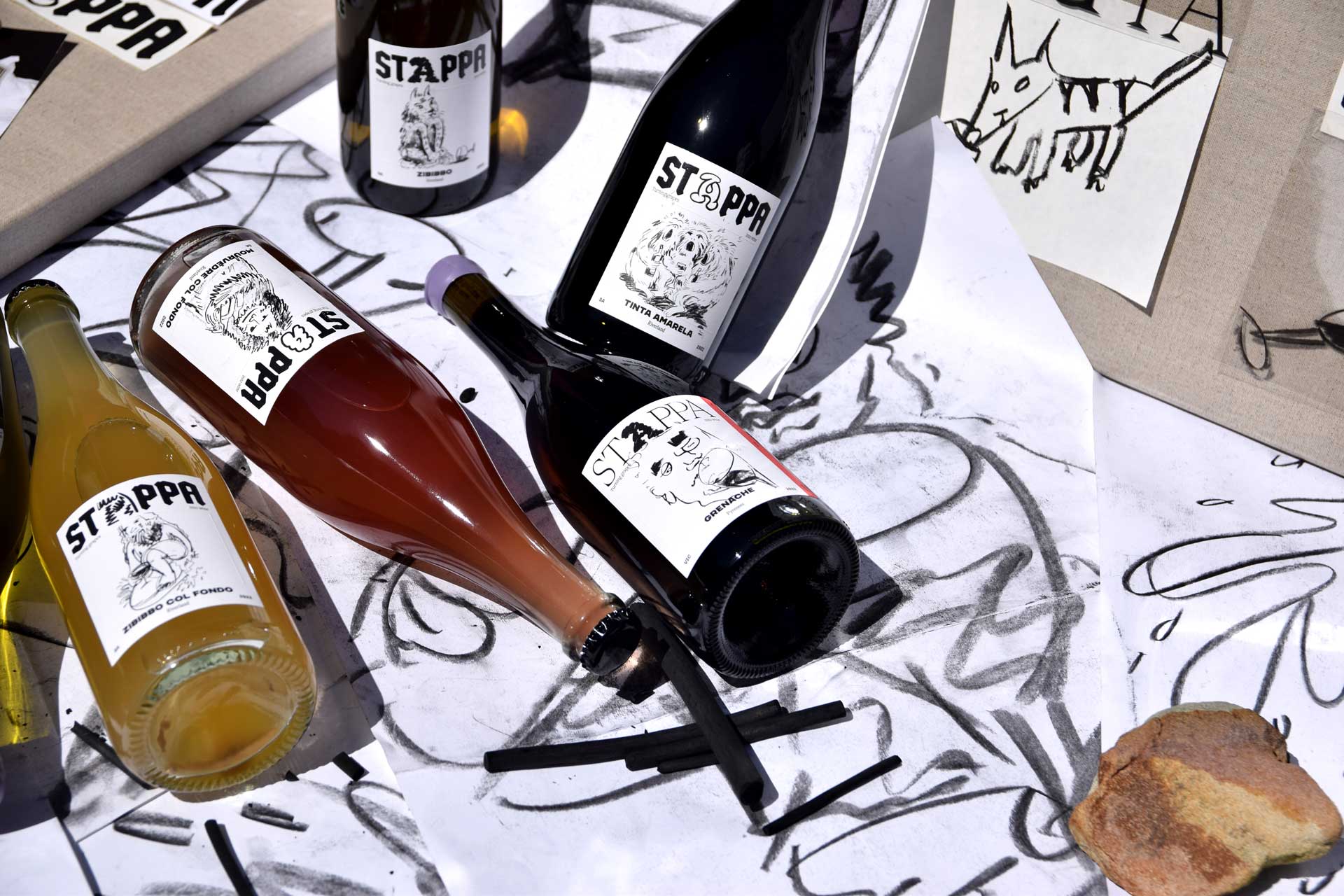
The process to take Stappa’s personality & brand strategy into the world of visual storytelling saw us quickly land on charcoal; its texture and metaphorical links to Australian soil and terroir, were compelling. We gathered the troops and churned through some furious studio sessions that had our pride peaking, our hands humming, wine sloshing, and brought back the joys of art school. With a solid deck of illustrations and creative satisfaction, Stappa’s identity was coming together.


Applications & production
The brand system differentiates between two product lines.

Dog Town Edition
Dog Town Edition are Stappa’s top-tier limited wines, released in small batches. The labels are more refined, using a more elegant typeface, a subtle red bar and illustrations with more of a fine art aesthetic.


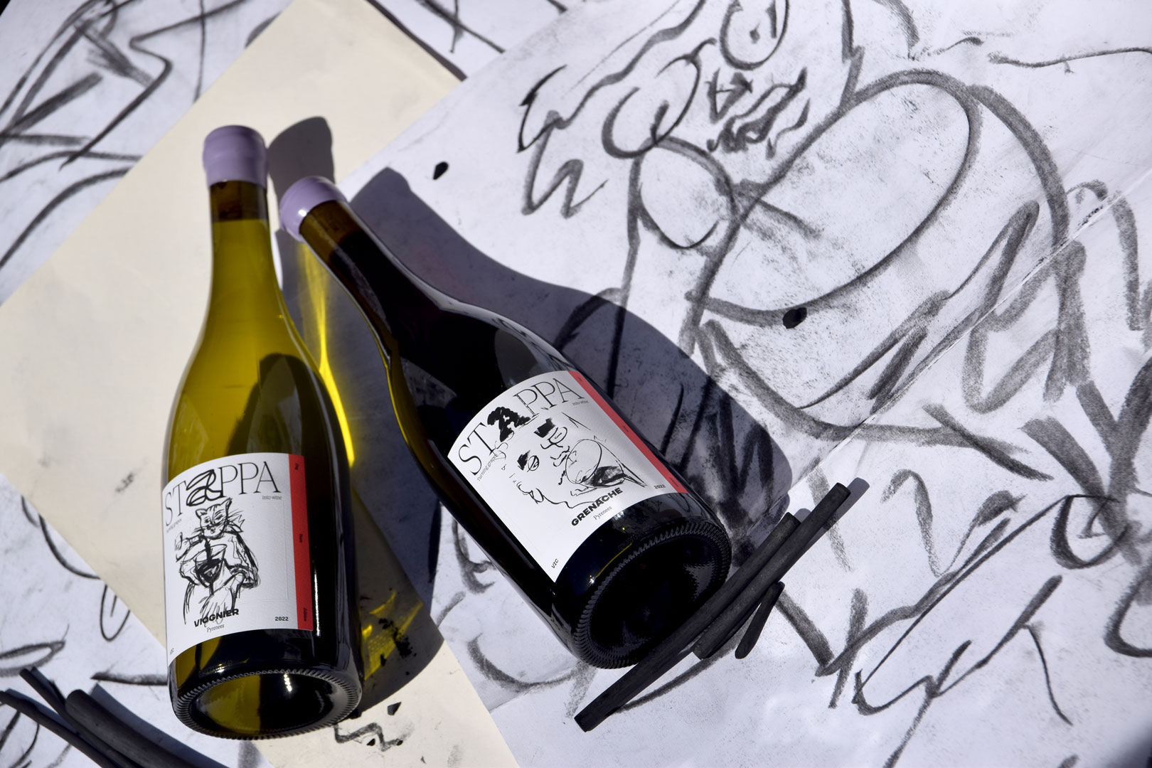


Stappa Standards
Stappa Standards sell at a lower price point and adopt a more low-fi appeal, unabashedly reflecting current trends and tastes. The illustrations are more playful and the label is more cheerful.


The system enables customers to easily differentiate between both individual products and product lines without sacrificing the opportunity for cross-selling and brand connection.
Applications were delivered across digital, print, merchandise, social media to create a clear foundation for Stappa’s future plans.
Applications were delivered across digital, print, merchandise, social media to create a clear foundation for Stappa’s future plans.
Launch & Activations
Throughout our work with Stappa, our studio has sought to push beyond what’s expected and help Stappa cut through the noise. We’ve done this by helping Dan and the team take a great brand and launch it authentically by using restaurant collaborations and events, social media campaigns, and even a dial-in recording for those who read the cork.