Beijing, China
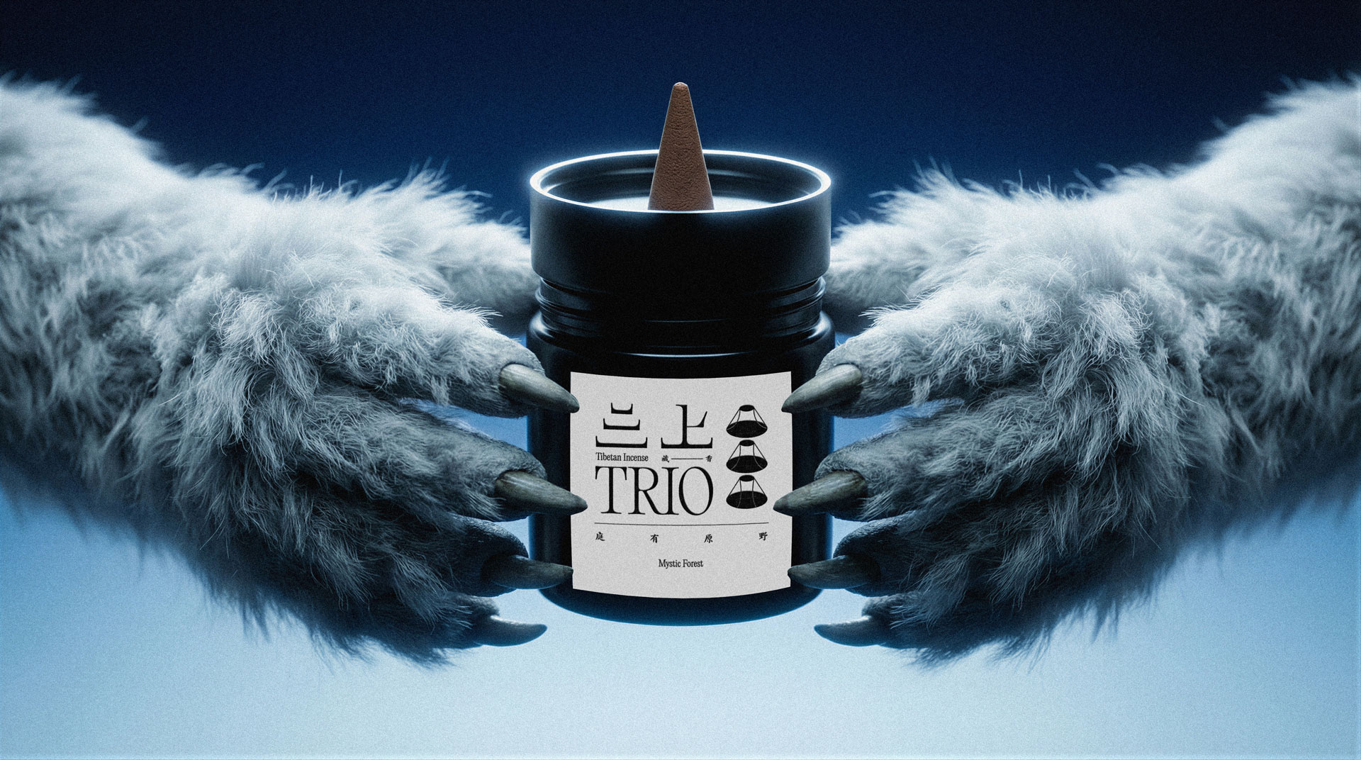
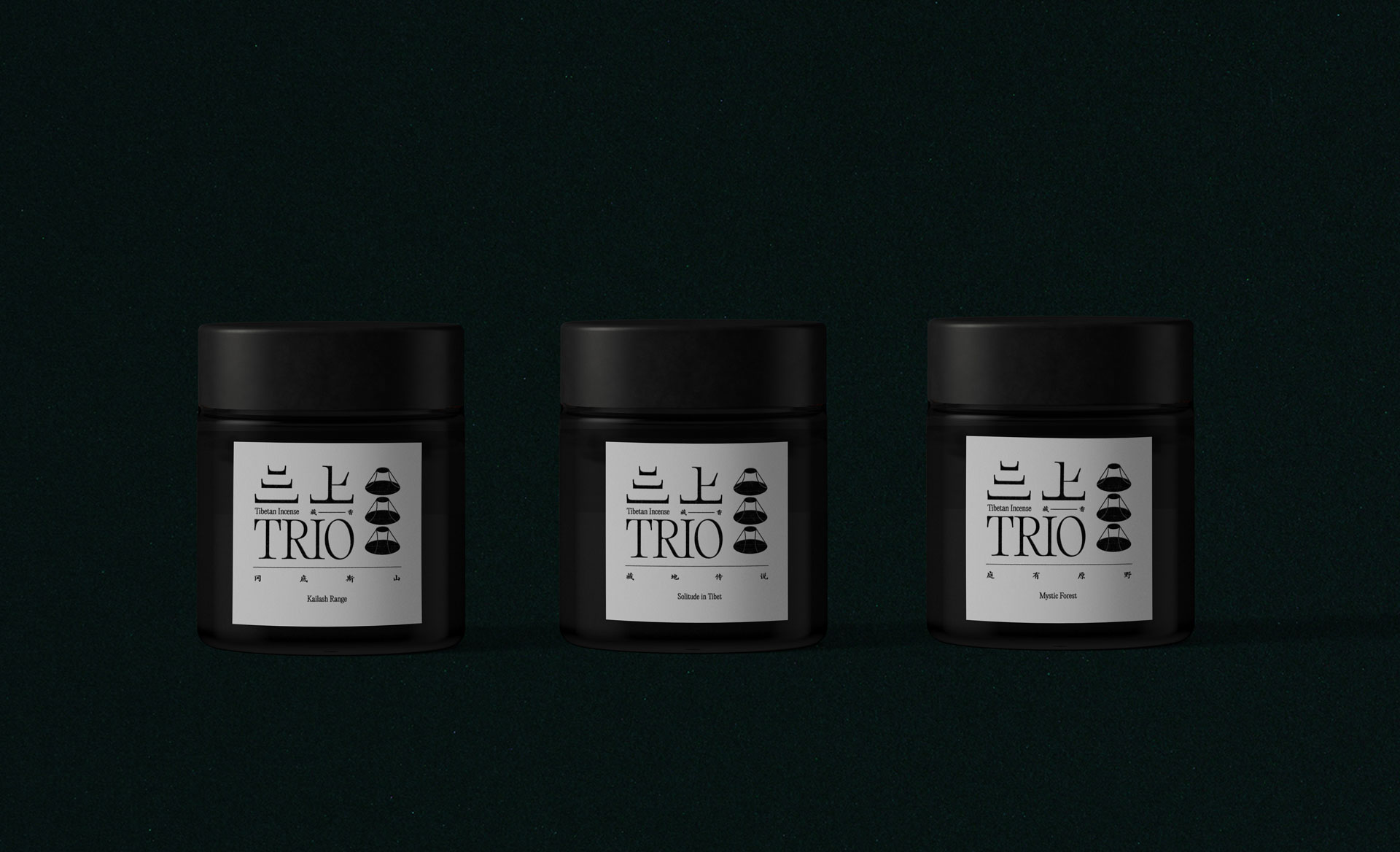
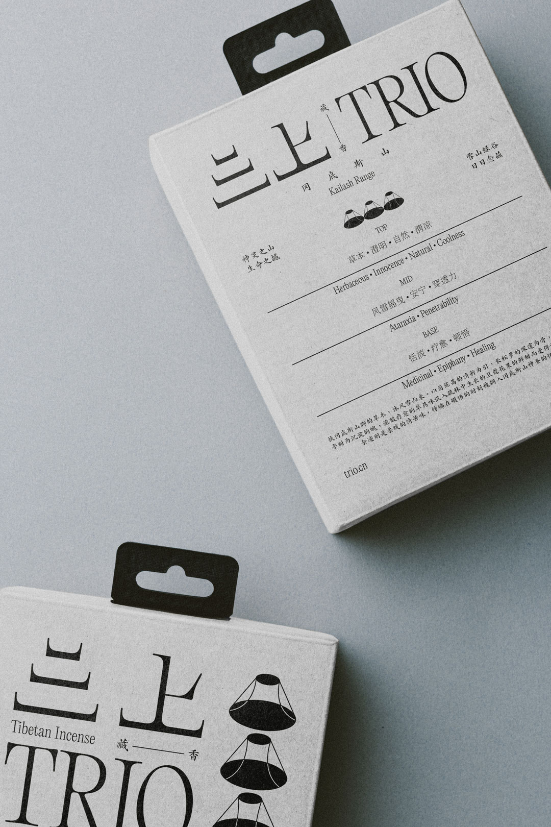
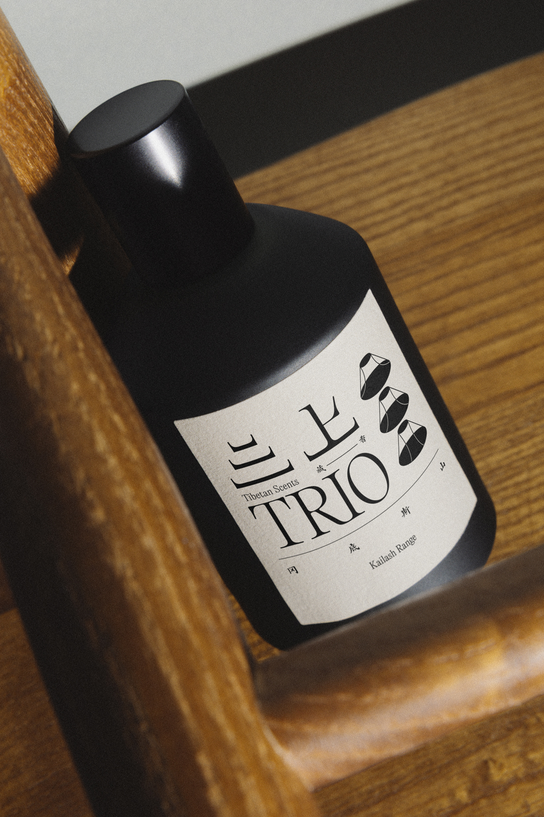
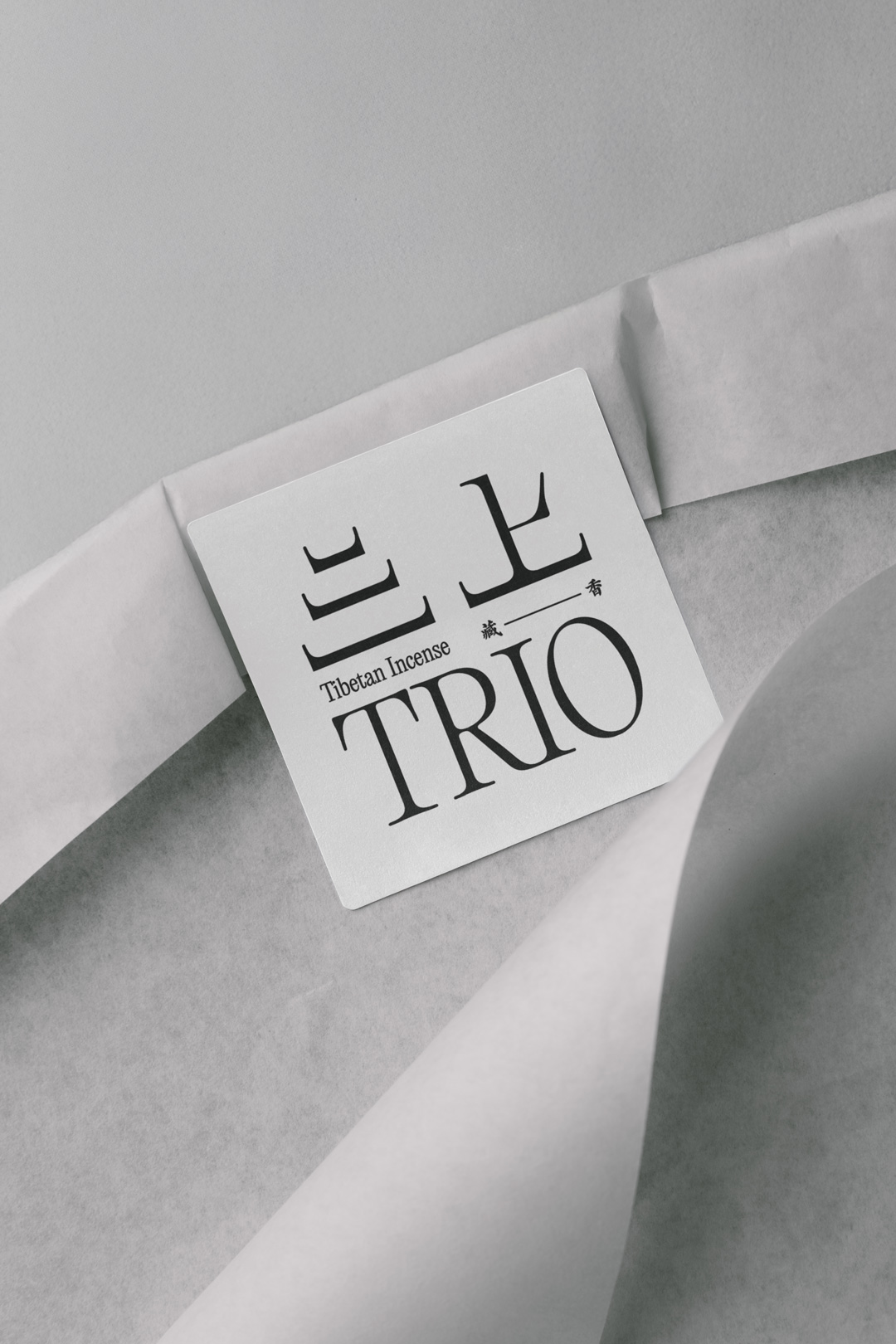
Trio 三上 Tibetan incense
Holy Mountain Turning.
Branding and Creative Direction for the 10th generation of incense maker in Tibet.
To reinterpret a practice that is deeply mystical, medicinal, and religious through a contemporary design lens — while maintaining absolute cultural respect and spiritual sensitivity. The objective was to position Trio 三上 as a refined, modern Tibetan incense brand that could resonate with both local devotees and a global audience seeking authenticity and ritual meaning.
Featured on
Scope
Strategy
Brand Strategy
Naming
Branding
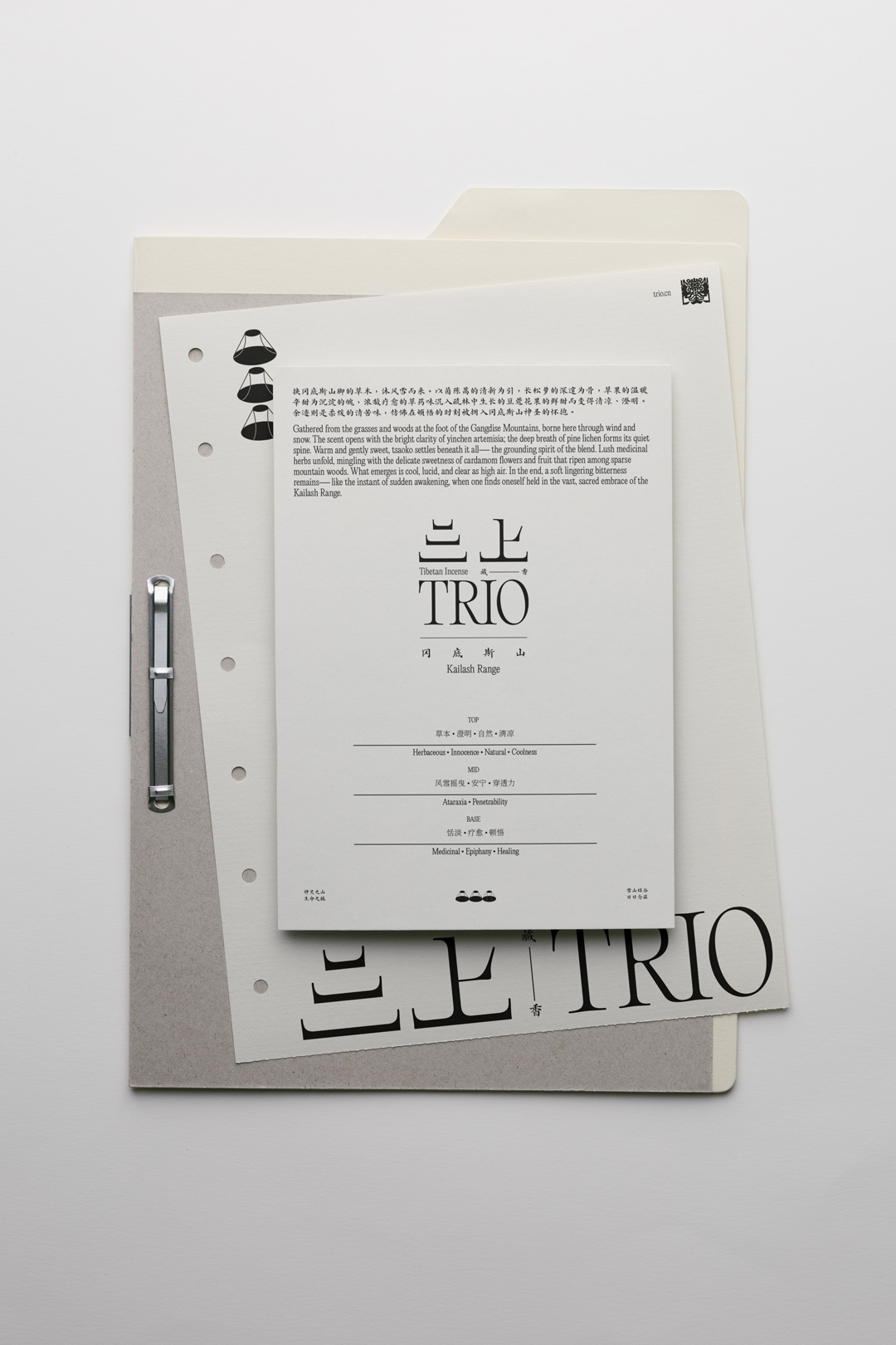
Brand Identity
Packaging Design
Campaign
Creative Direction
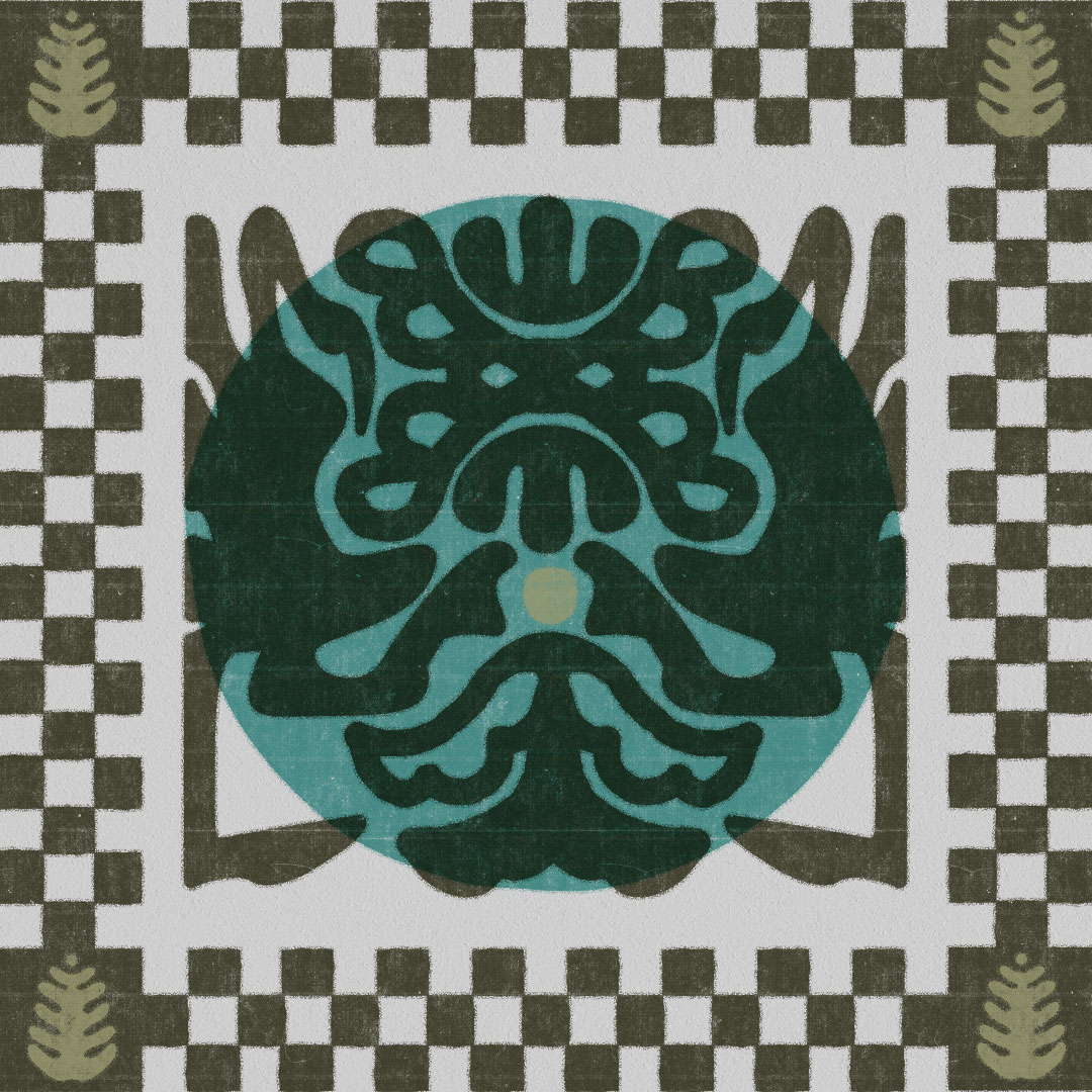
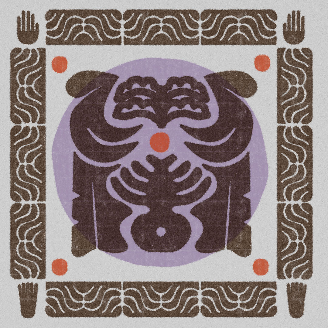
Heritage & Cultural Context
Trio 三上 is crafted by a 10th-generation Tibetan incense maker whose lineage embodies centuries of sacred knowledge and botanical expertise. In Tibetan culture, incense burning is not merely aromatic — it is a ritual technology of healing, purification, and spiritual offering. Formulas are traditionally composed of high-altitude herbs and resins gathered from the Himalayan plateau, used in monasteries, homes, and pilgrimage ceremonies.
Working closely with the client, Chen Chen approached the design process as an act of cultural stewardship. Every visual decision was measured against the spiritual significance of Tibetan Buddhist symbolism, ensuring the brand could feel progressive without becoming reductive or ornamental.
Concept & Visual Strategy
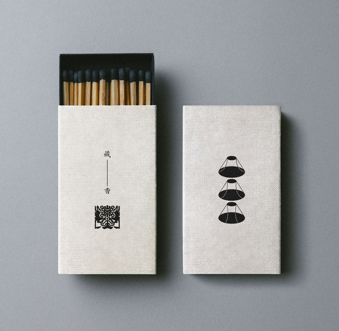
The core inspiration emerged from two powerful sacred references: the Buddhist svástika, an ancient symbol of auspiciousness and cosmic harmony, and Mount Kailash (Kangrinboqe) — one of the most revered mountains in Tibetan Buddhism and the center of the ritual pilgrimage known as Kora, or “mountain turning.”
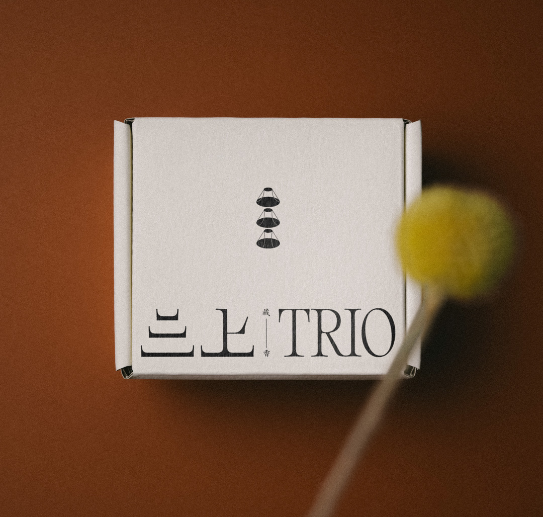
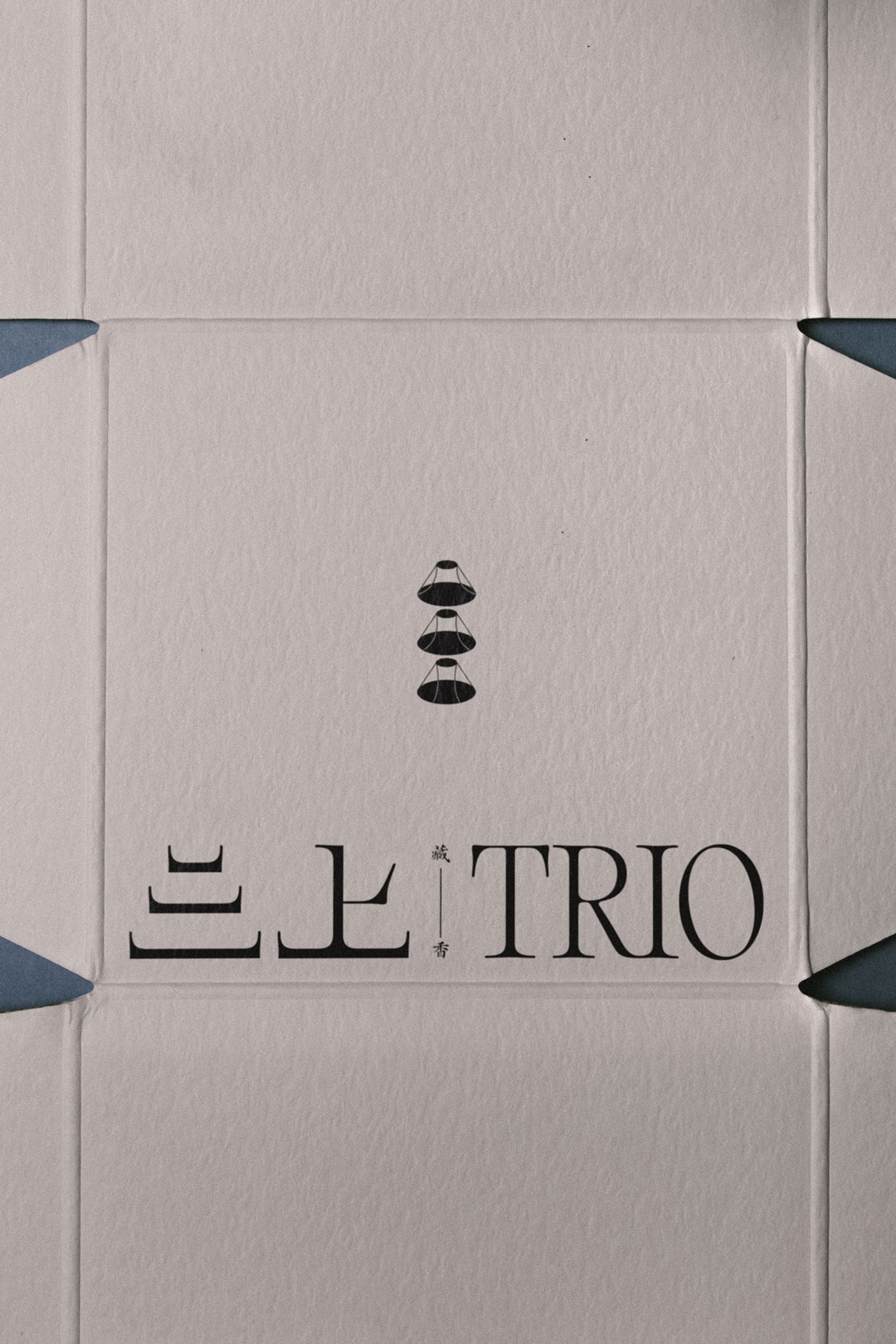
The brand mark was developed by abstracting three distinct angular perspectives of Mount Kailash, forming a geometric triadic structure that subtly echoes the rotational movement of Kora. This tri-directional form also reinforces the name Trio 三上, symbolizing ascent, continuity, and cyclical devotion. Rather than depicting sacred imagery literally, the design translates spiritual motion into modern visual language — allowing reverence to be conveyed through structure and rhythm.
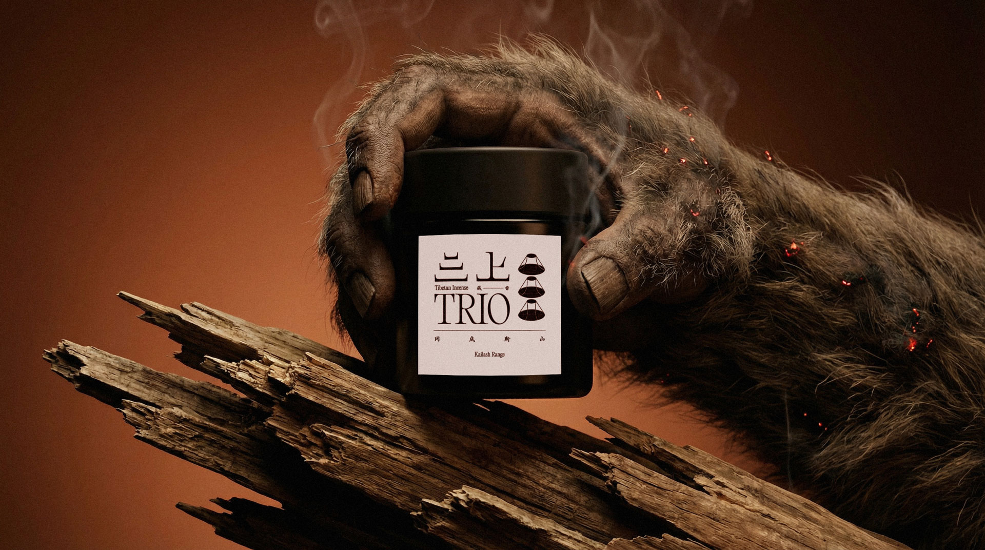
The final identity for Trio 三上 establishes a new visual language for Tibetan incense: one that honours generational tradition while embracing modern sensibilities. By translating pilgrimage, sacred geometry, and mountain symbolism into refined graphic form, the brand achieves a quiet balance between mysticism and clarity.
The project demonstrates how culturally rooted design can evolve without dilution — transforming ritual heritage into a thoughtful, contemporary presence for global audiences seeking depth, authenticity, and mindful living.