Sydney
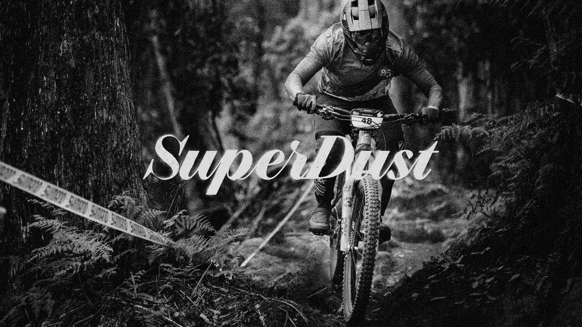
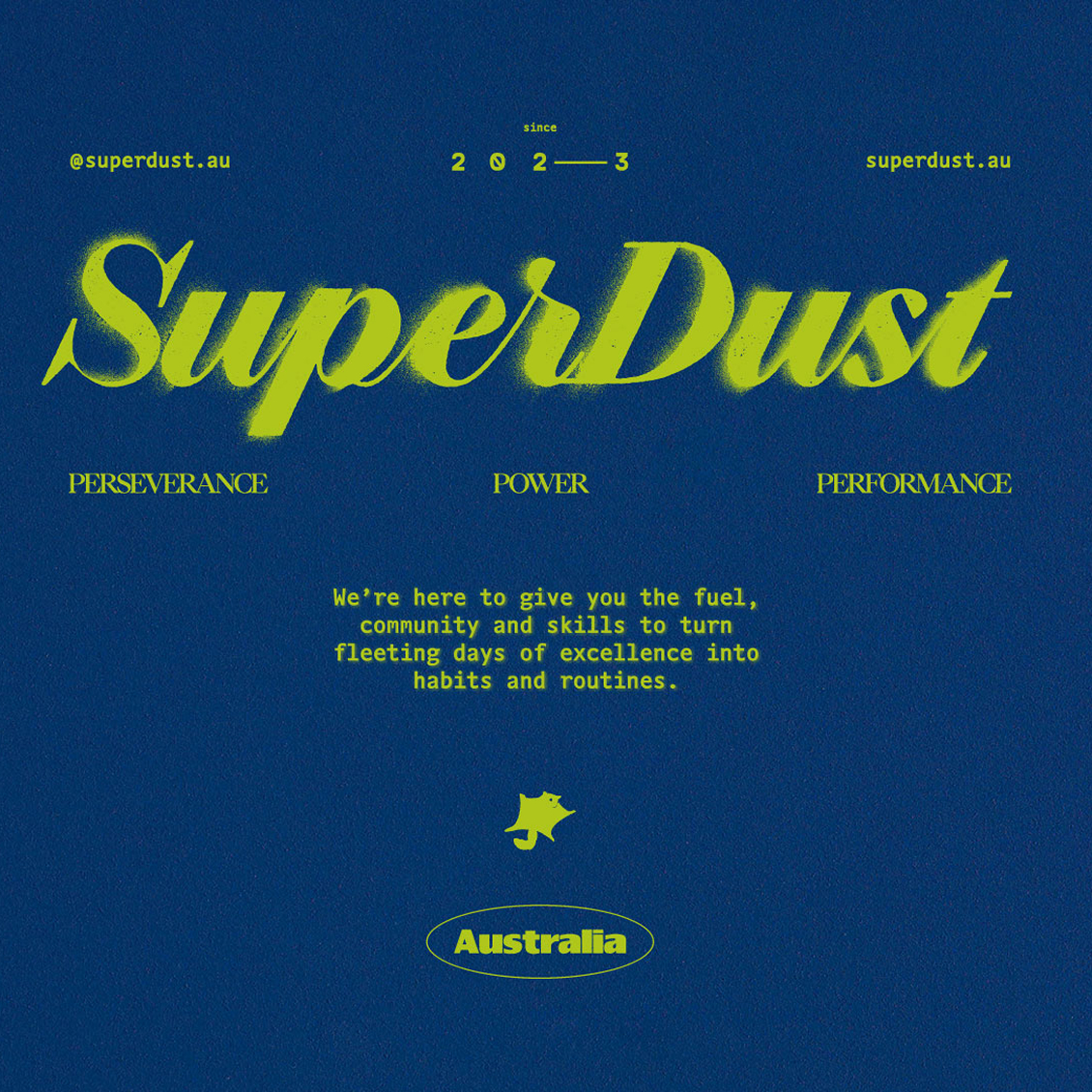
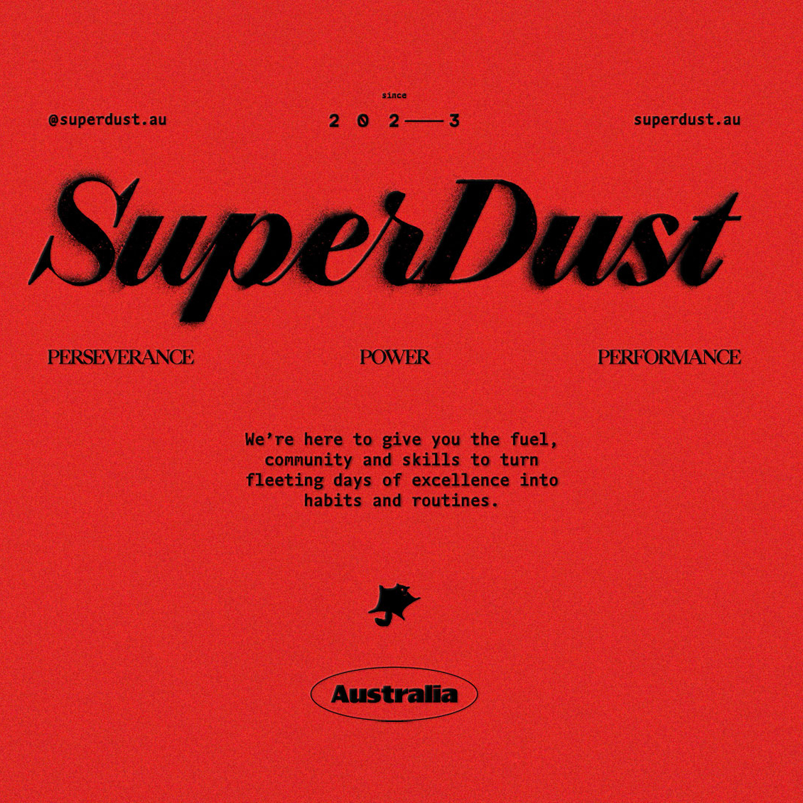
SuperDust
Margin Mountains.
Brand creation and campaign for SuperDust—Australia’s premier MTB coaching platform.
SuperDust exists to push elite mountain bikers further—helping athletes transition from good to great, and from amateur to pro. We partnered with the team to craft a brand that reflects their high-performance ethos, curates top-tier products and services, and resonates with riders serious about leveling up.
Visit Site
SuperDust
Featured on
Scope
Strategy
Brand Strategy
Audience Analysis
Voice & Messaging
Naming
Social Media Strategy
Branding
Brand Identity System
Brand Guidelines
Illustration & Motion
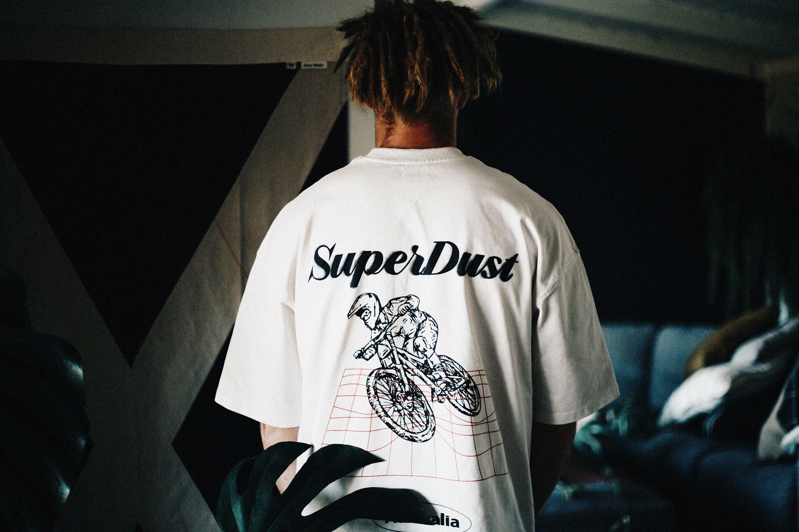
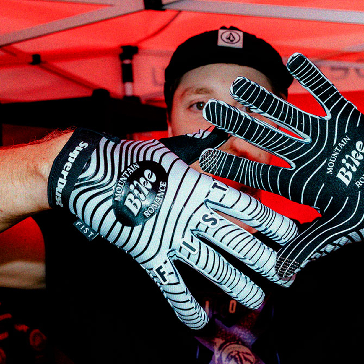
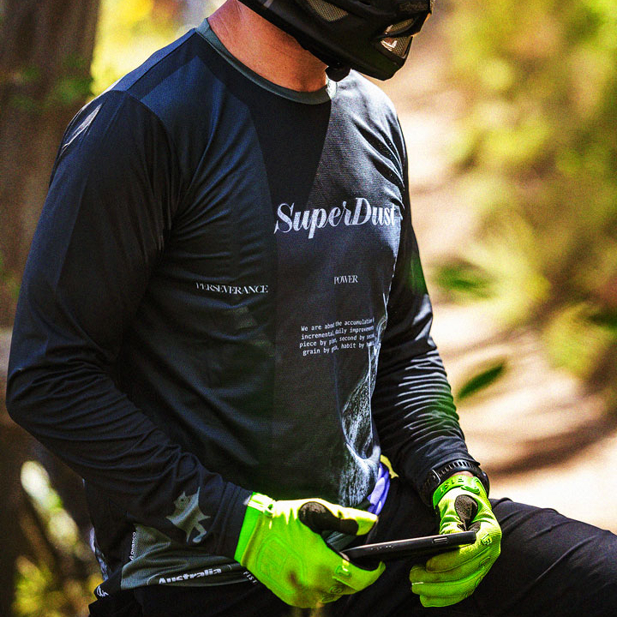
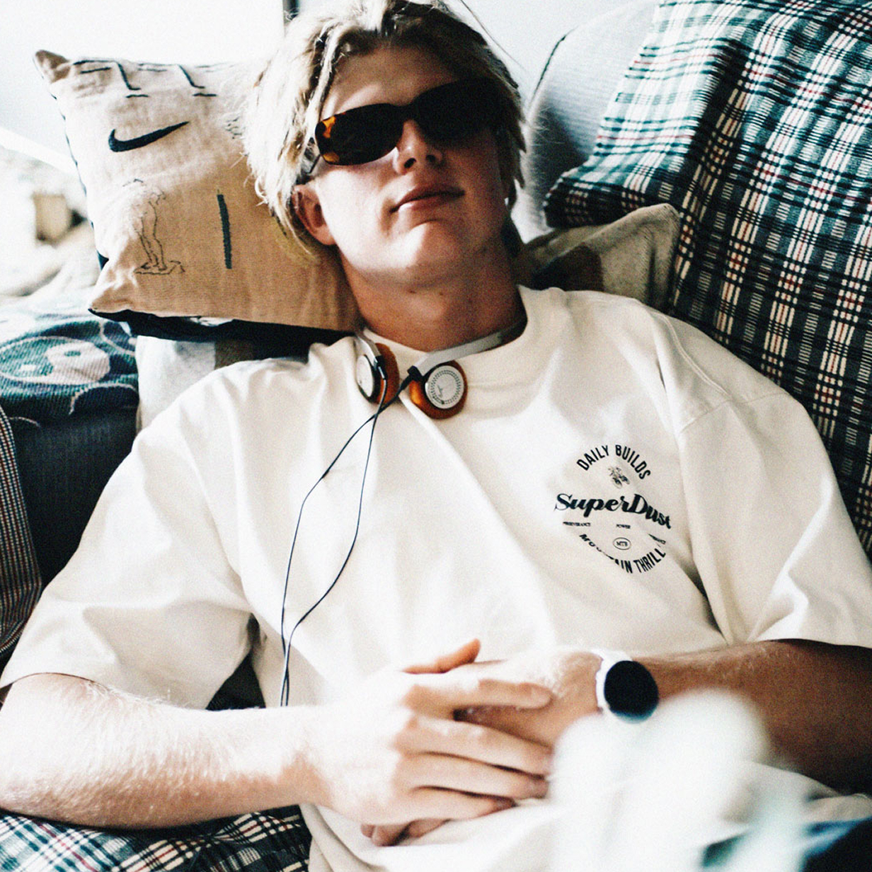
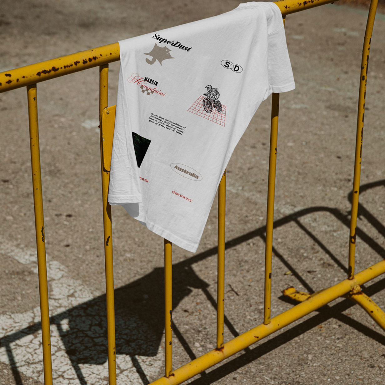
Apparel Design
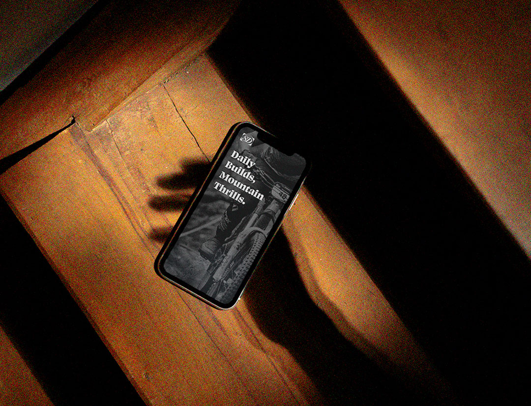
UX & UI Design & Dev
Copywriting
Campaign
Creative Direction
Messaging
Social Media Campaign
Background
Our client came to us at an exciting stage of business. They’d had an exciting business plan and had acquired the means to make it a reality. They needed branding and design services to help them translate their vision into a compelling brand identity and roll it out across a suite of new products, services, and marketing activities.
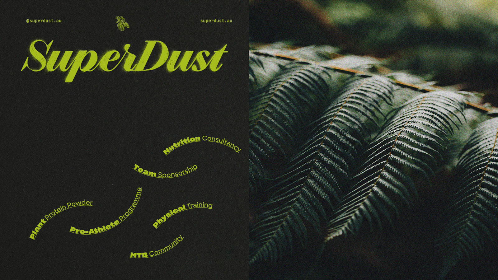
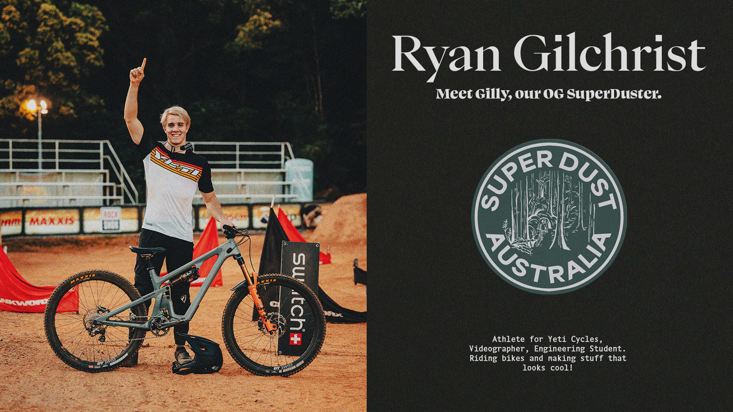
SuperDust curates products and services that help elite Mountain Biking athletes make the transition from good to great, and from amateur to professional. They are deeply connected to the MTB community, engaging riders like two-time Australian champion and World Cup winner Ryan Gilchrist in the development of nutritional supplements and a rider program.

Studio Chenchen has worked as SuperDust’s creative partner to turn their business plan into a connected and cohesive brand system and identity. Our services have spanned brand naming to product photoshoots, and we continue to support SuperDust to express their brand across an ever-growing suite of assets. The company is on track for brand-led success. It has become a central part of Australia’s MTB scene, championed by professional riders, elite trainers, respected videographers, and the broader MTB community.
SuperDust’s brand needed to reflect the core mission of the company and the vision of its founders. As part of our standard process, Studio Chenchen takes our clients through a process to identify and distil these goals, developing a brand strategy that culminates in a set of findings and a creative concept.
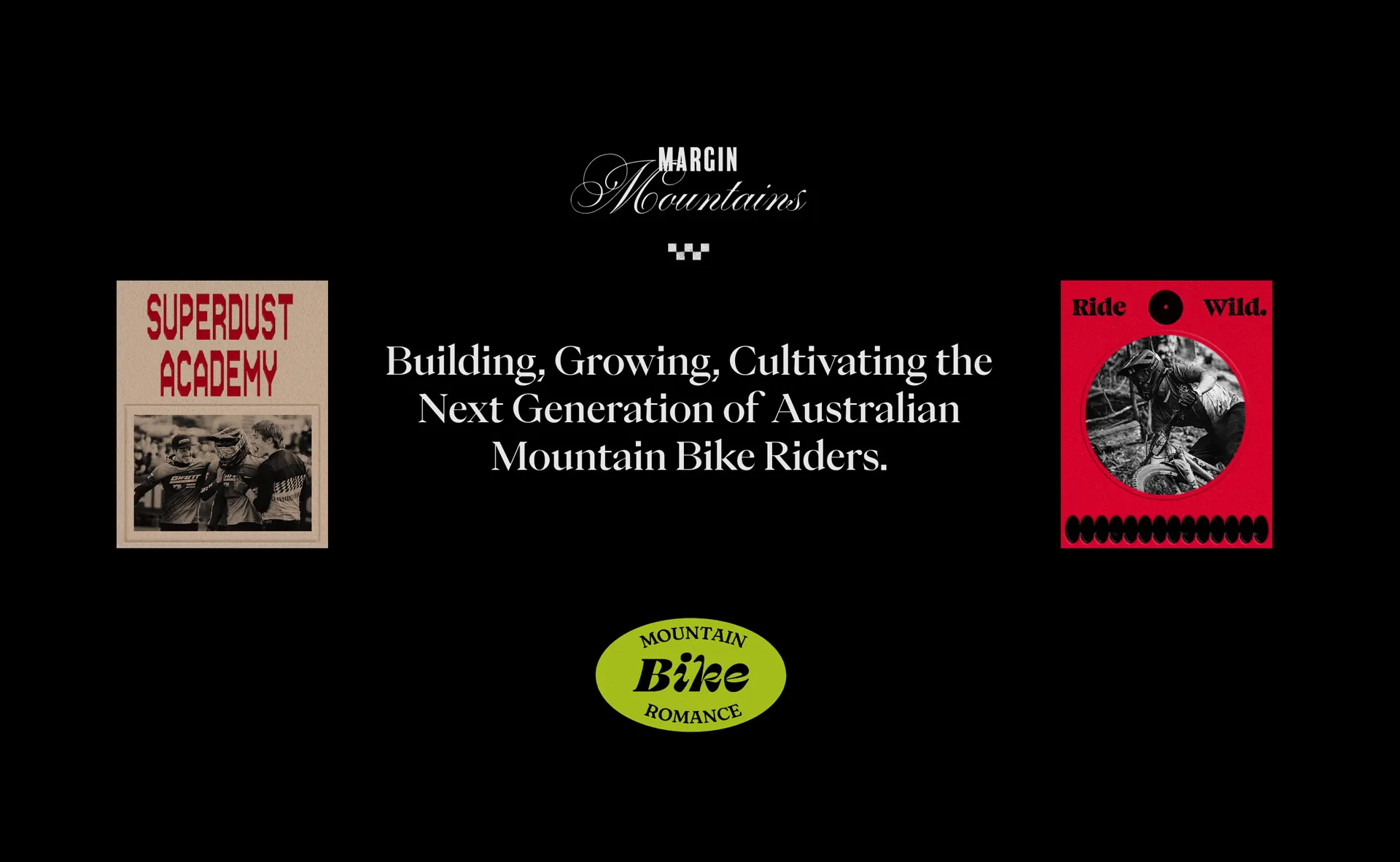
Creative Concept
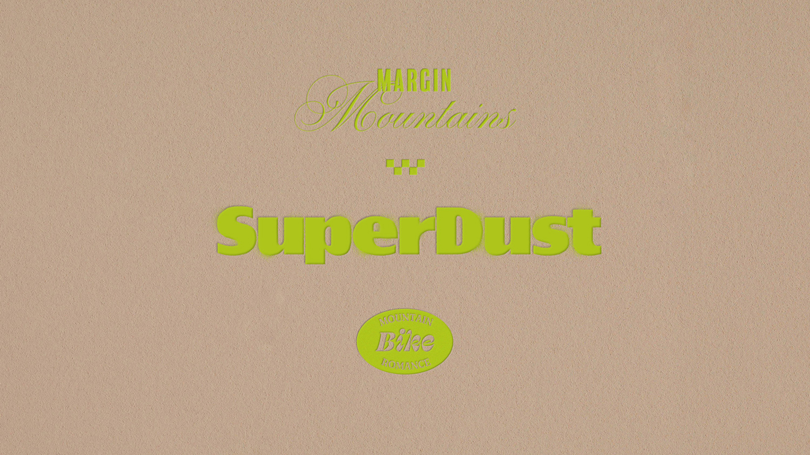
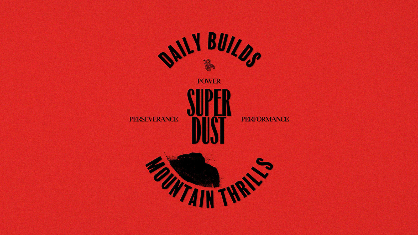
For SuperDust, the creative concept we identified for the brand is called Margin Mountains. We captured what it means in an adaptive and carefully curated set of Brand Guidelines that turns abstract goals and aspirations into specific design elements, and photographic styles, and asserts a deliberate Tone of Voice.
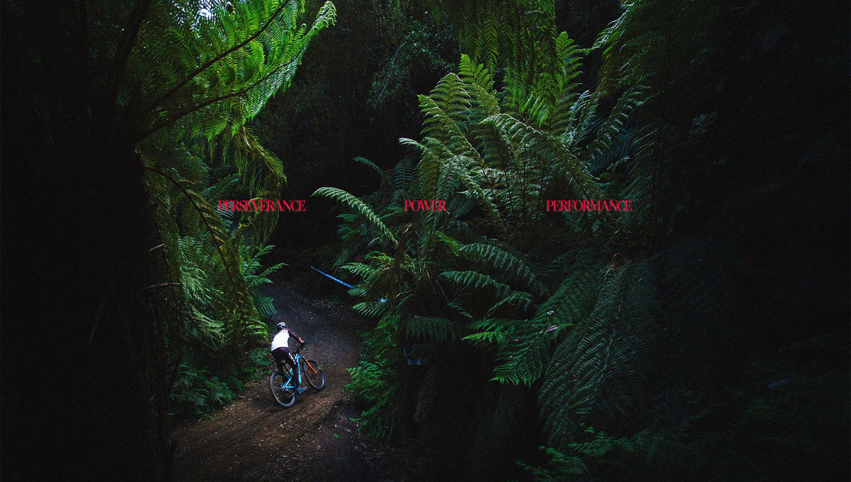
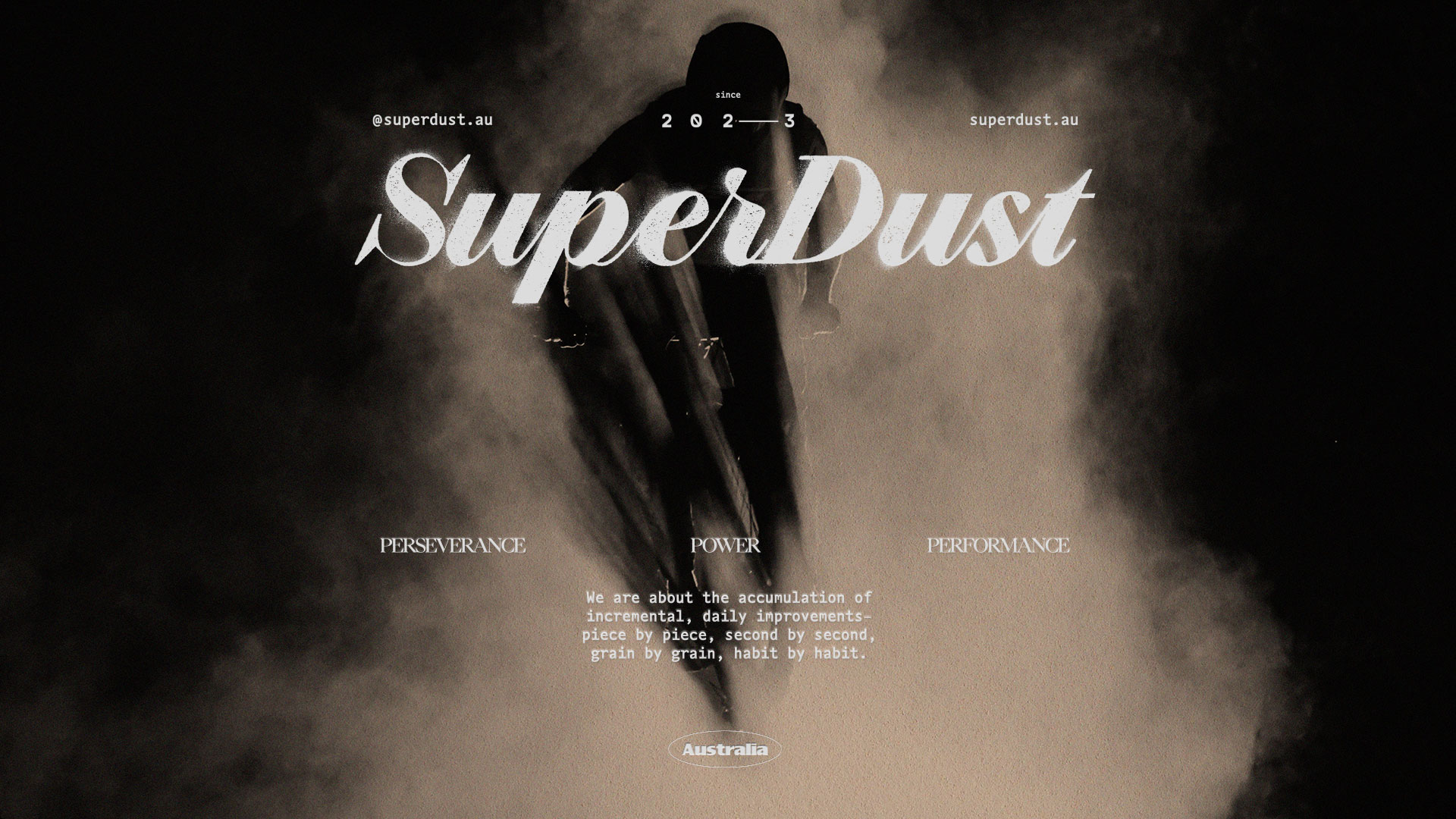
There’s a simple but hard-to-realise formula for success that sits within SuperDust’s offering: Perseverance + Power = Performance.
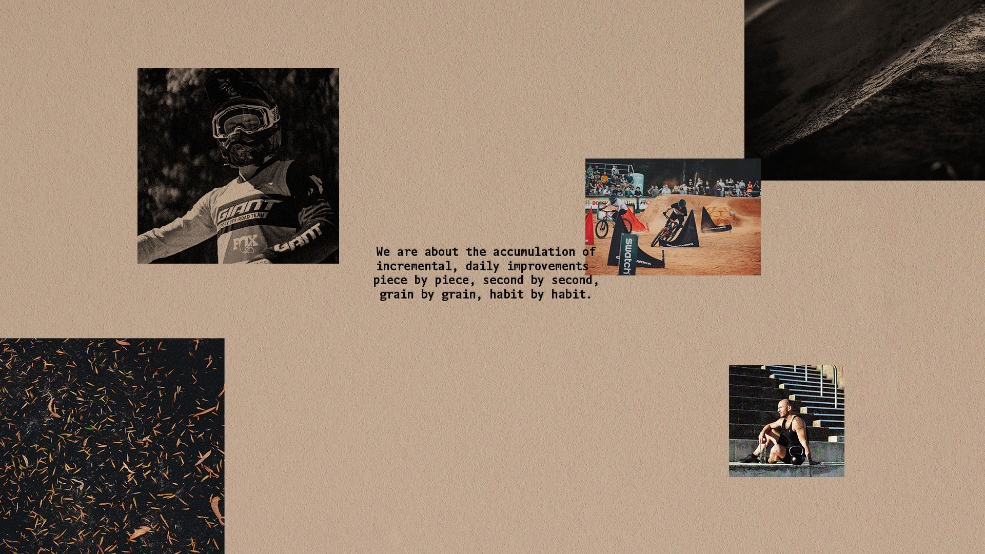
In this concept, we’re leaning into the grit that this requires. It’s the harsh reality that success relies on the accumulation of incremental, daily improvements– piece by piece, second by second, grain by grain, habit by habit.
Visual Language
Visually, we’re focusing on the elite end of our brand– the aspiration of our riders. We communicate an aesthetic that blends the soul of the outdoors with the performance and competition that drives our riders to our brand. While doing this, we don’t want to lose touch with the fun that riding brings, the spirit that drives it, and the personality of our brand, and the sport.
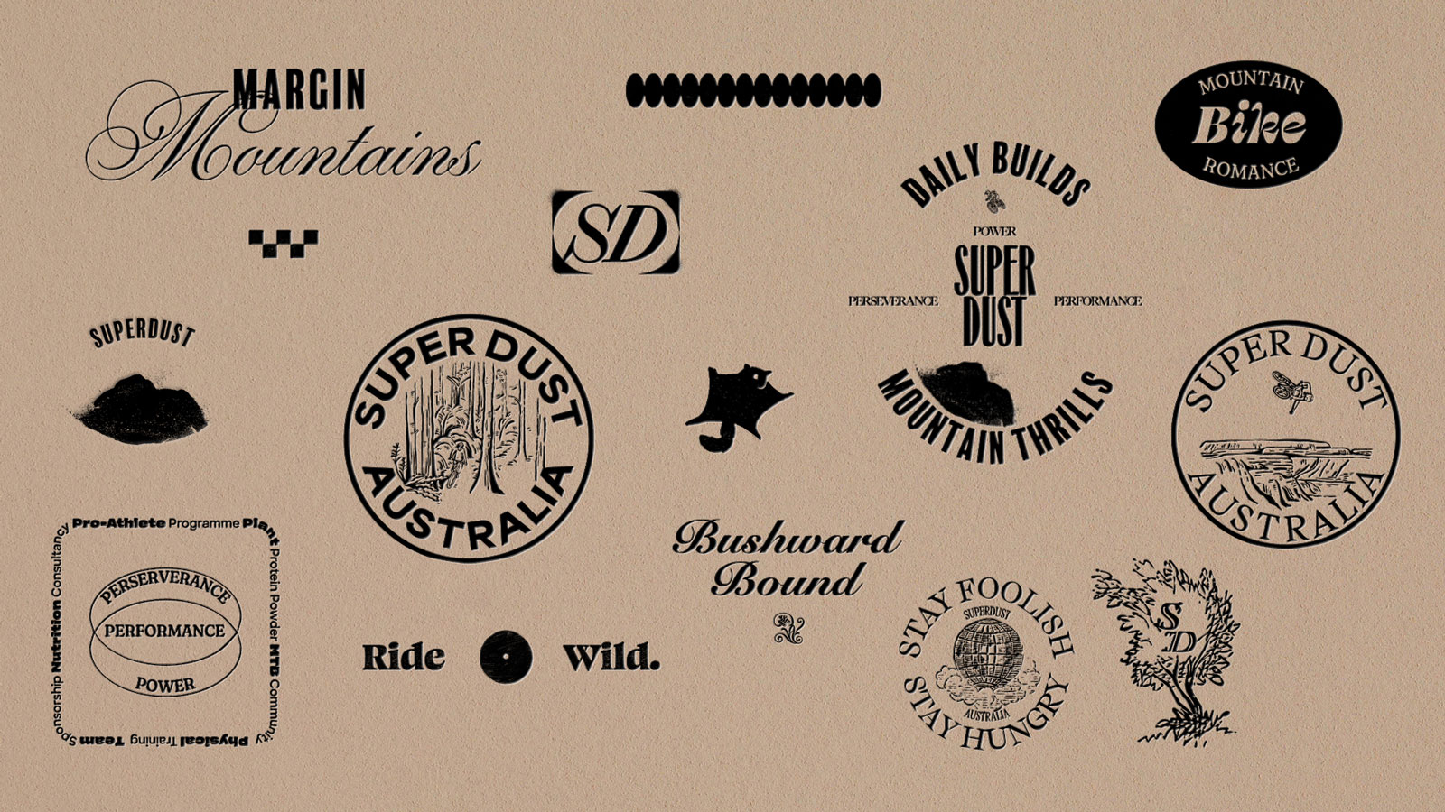
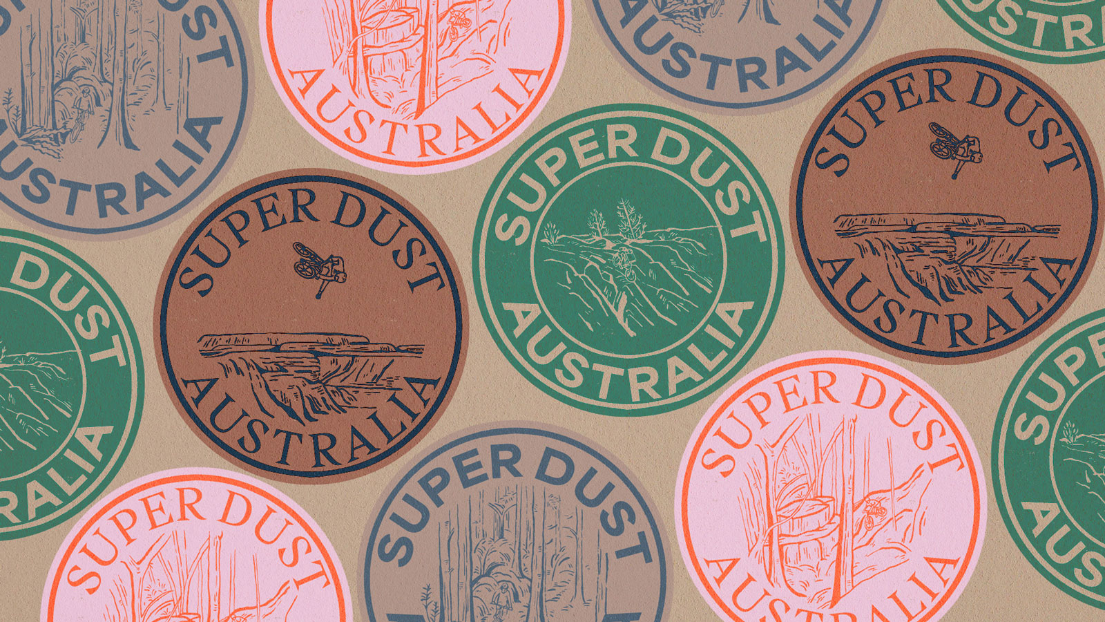
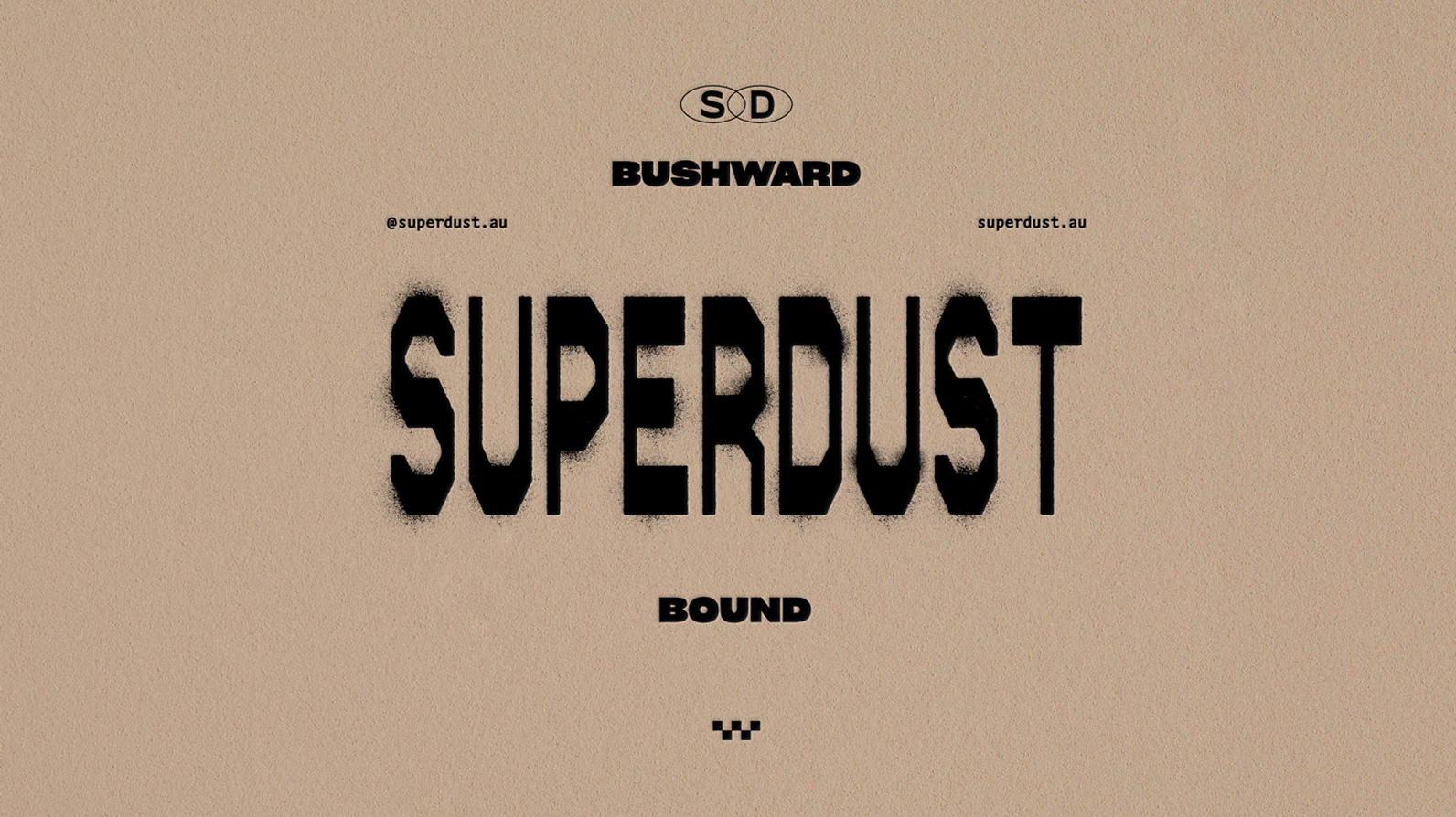
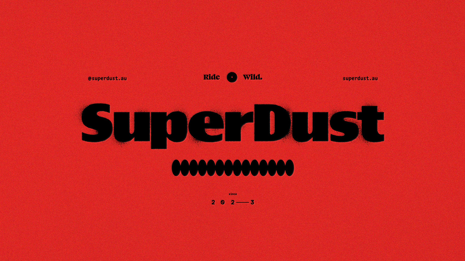
A Suite of Brandmarks
Our system uses lock-ups in various shapes. The design is refined and up-market. A variety of lock-ups lets us capture different impressions. The central ones communicate our view that training is a science, while more peripheral expressions connect the core brand to the idea that riding is like an outdoors club that fuels adventure and fun in the bush.
Collectively, we keep a raw grass-roots feel but carry a central brand message and visual language that say’s we’re mature and performance oriented.

Application
The brand takes shape across an ever-growing landscape of print, digital and environmental assets. It lives in the SuperDuest social media and an e-commerce website, the team uniforms of professional riders, the packaging of nutritional products, and in the collateral used at ride events and stalls.
Key activities so far have included art-directing a photoshoot with MTB riders and brand partners and ambassadors, in collaboration with leading MTB videographers such as Jasper Da Seymour. Alongside this, we maintain brand-led social media strategy that links design templates to different content channels that emphasise different parts of the brand.