Sydney, Australia
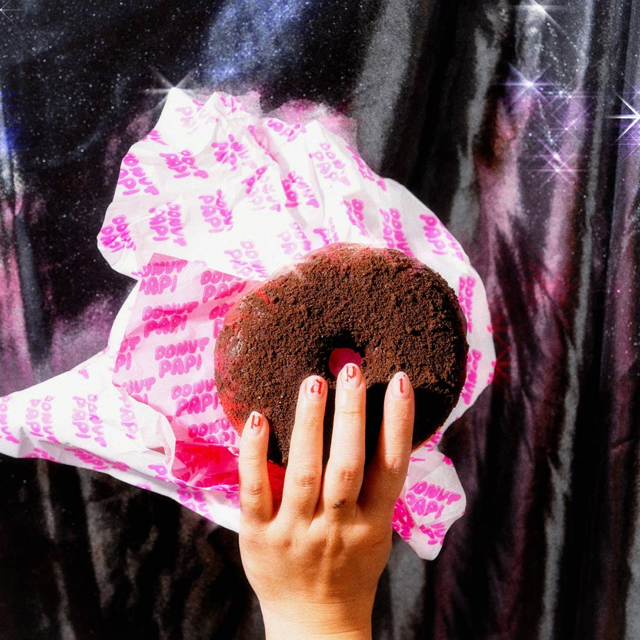
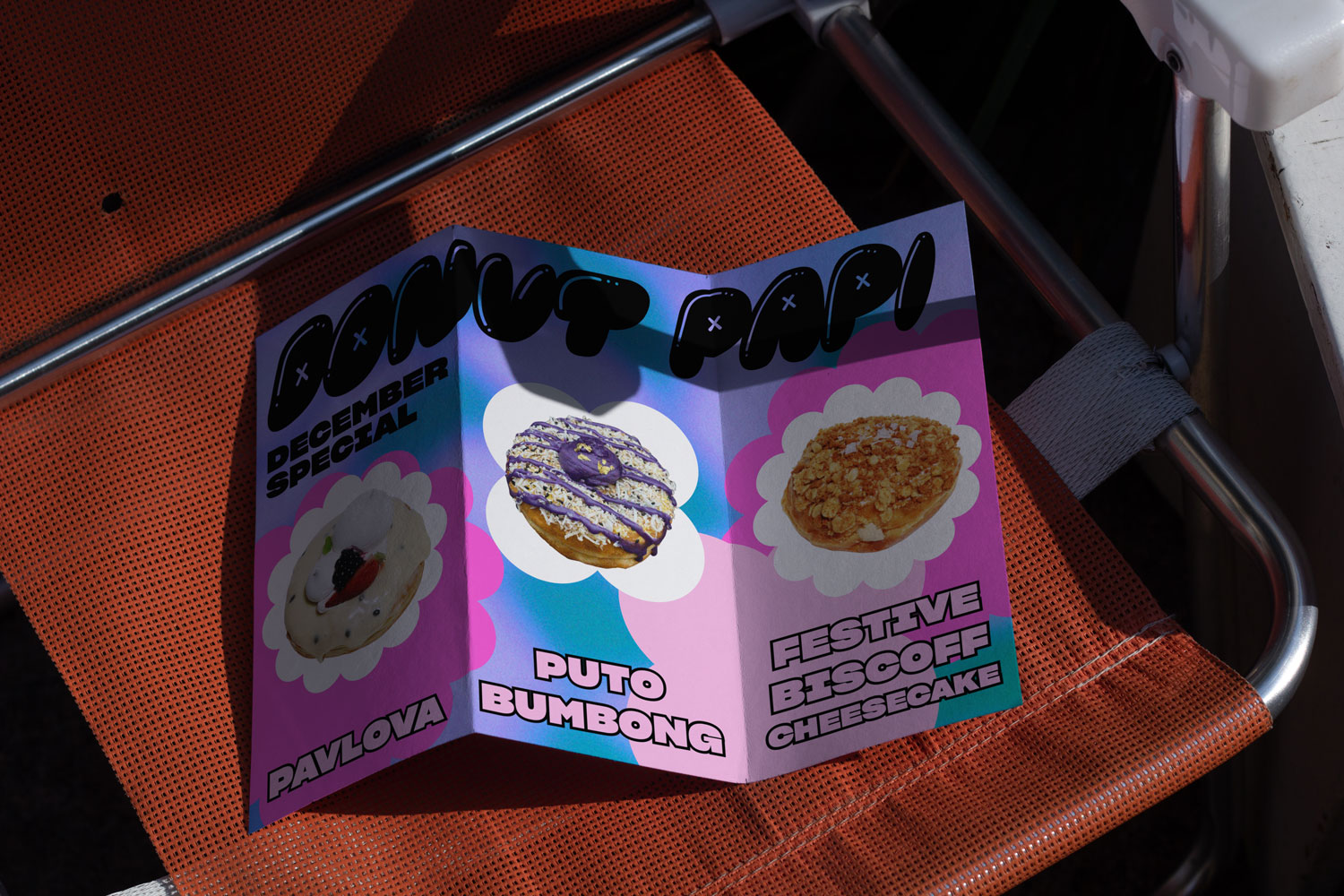
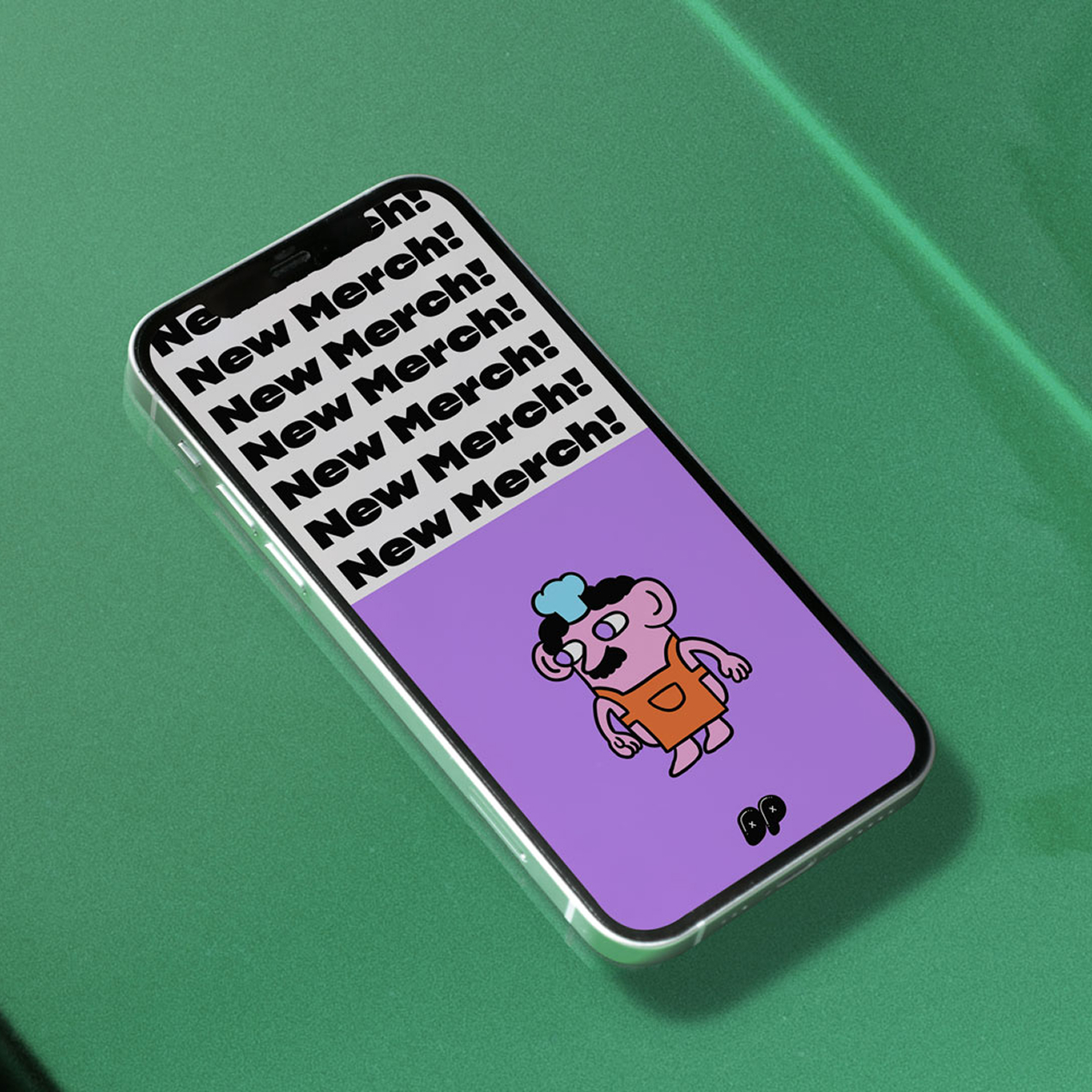
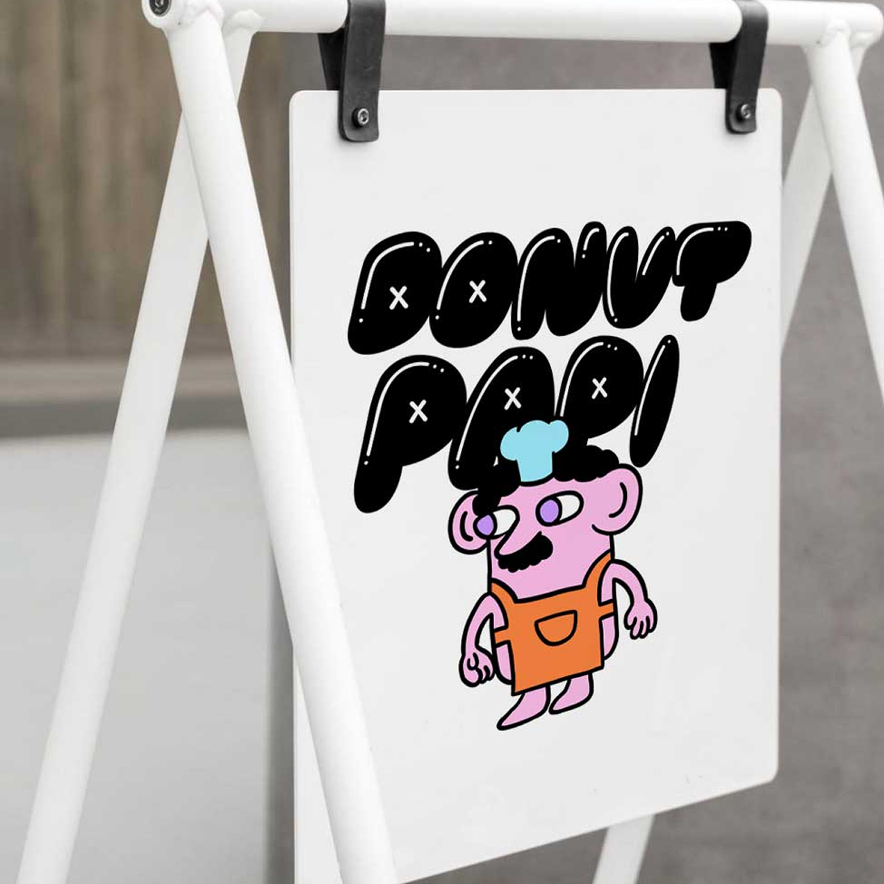
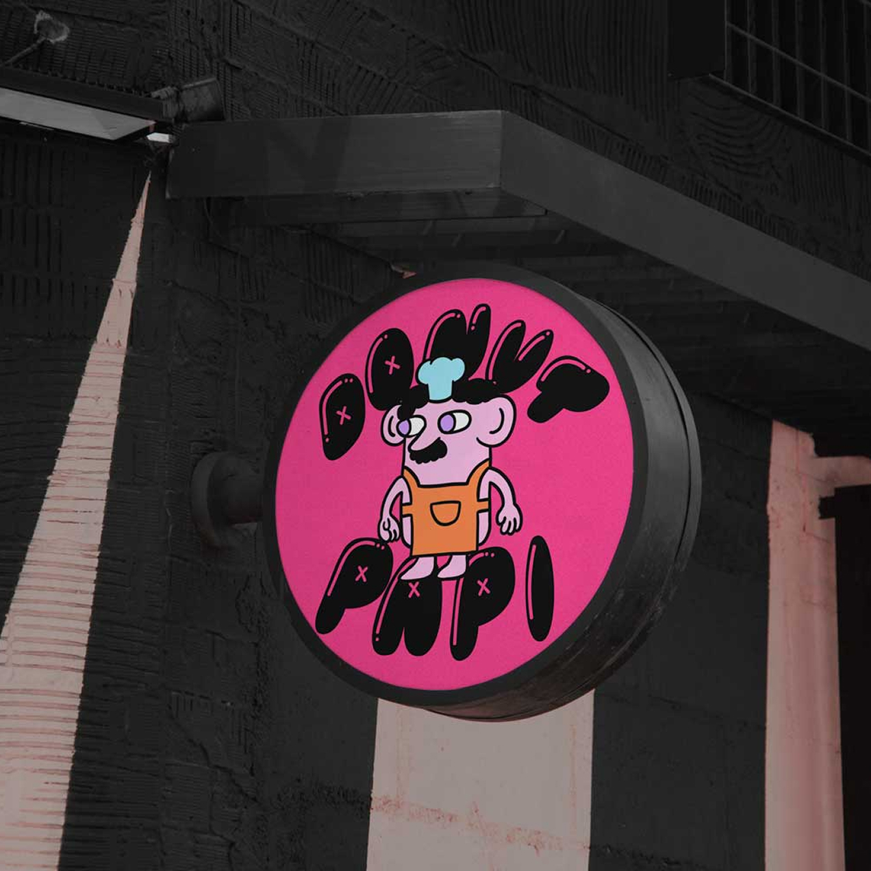
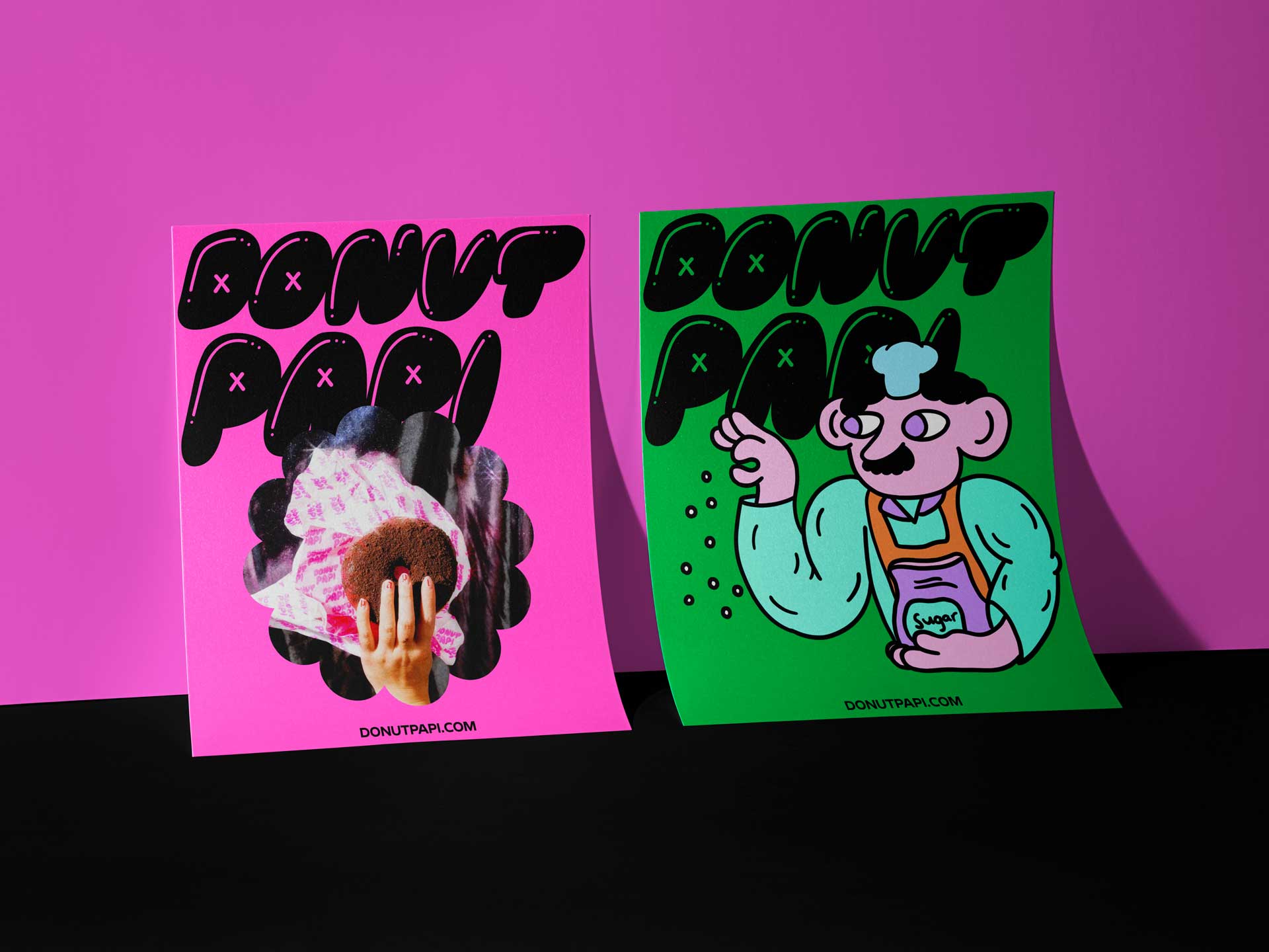
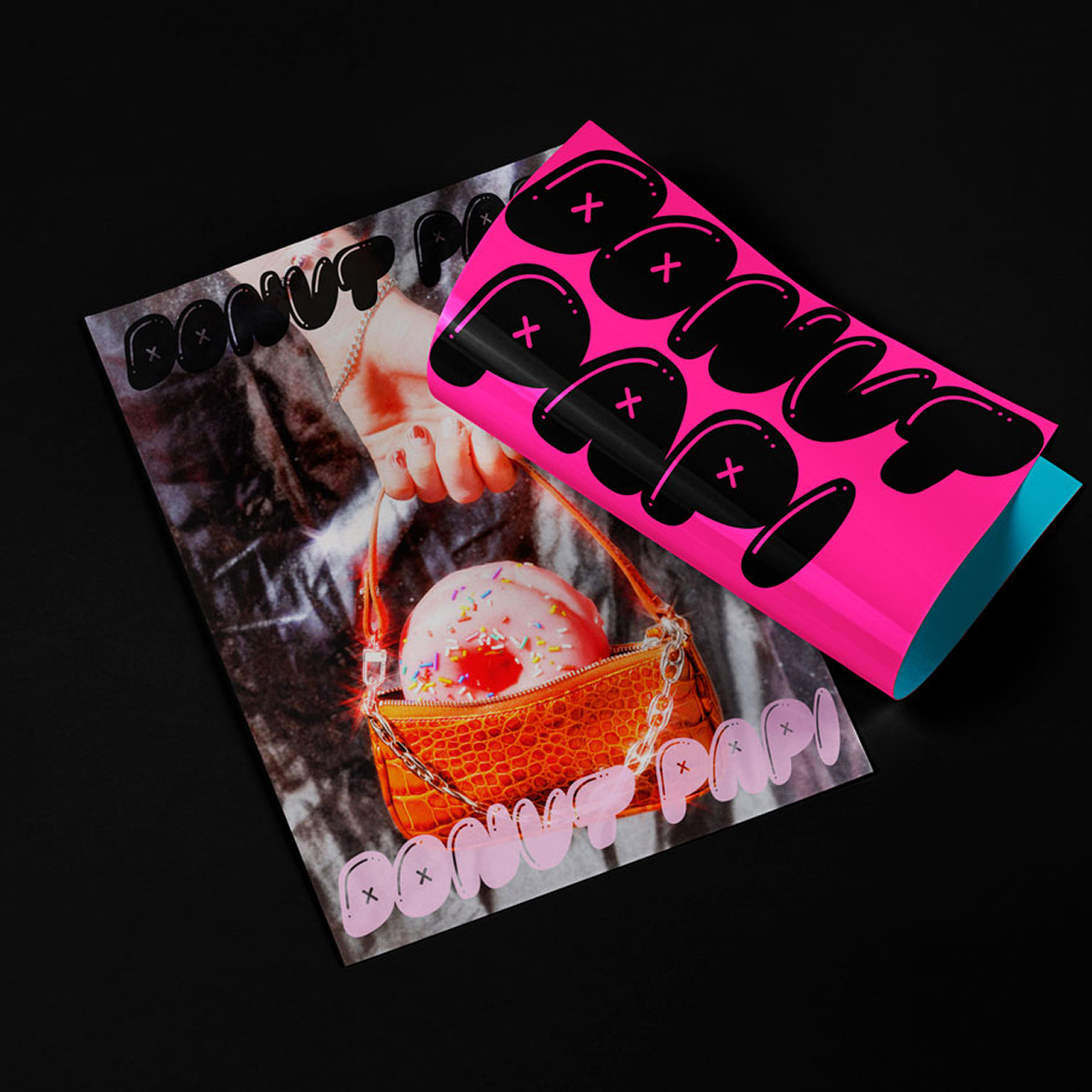
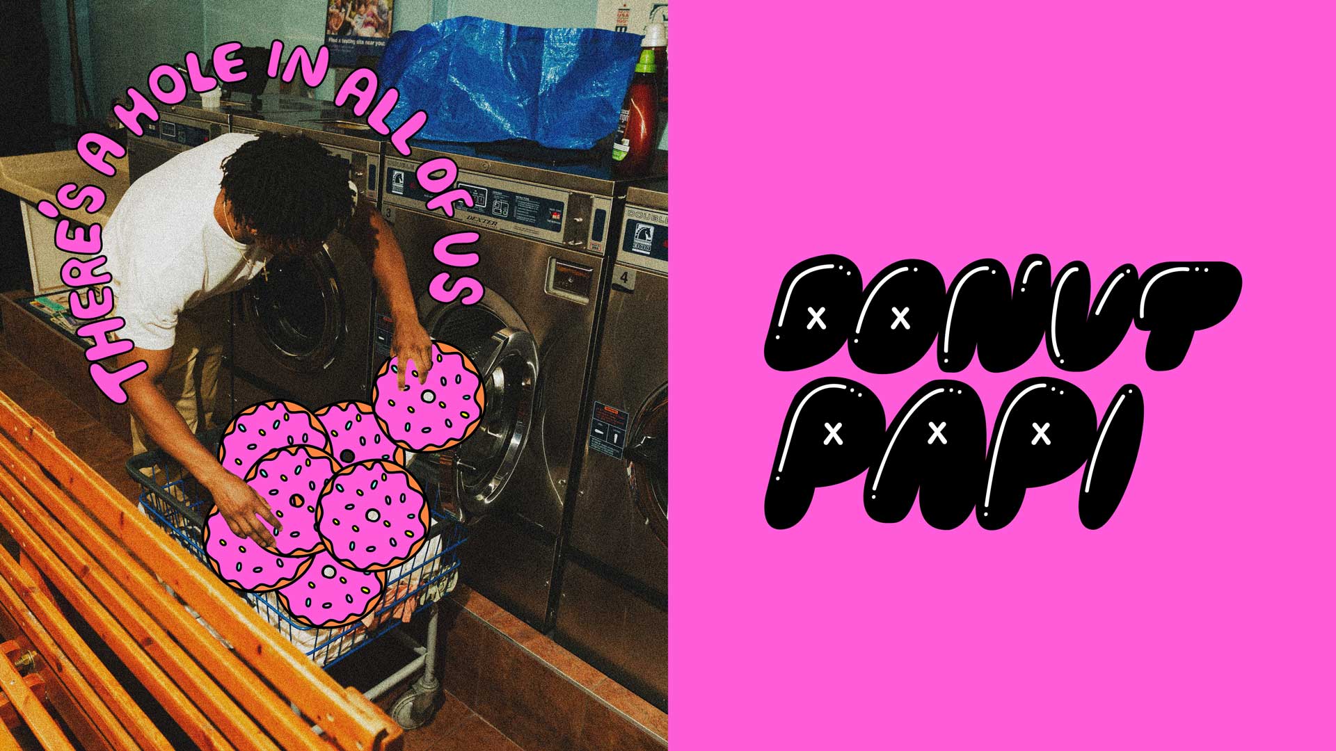
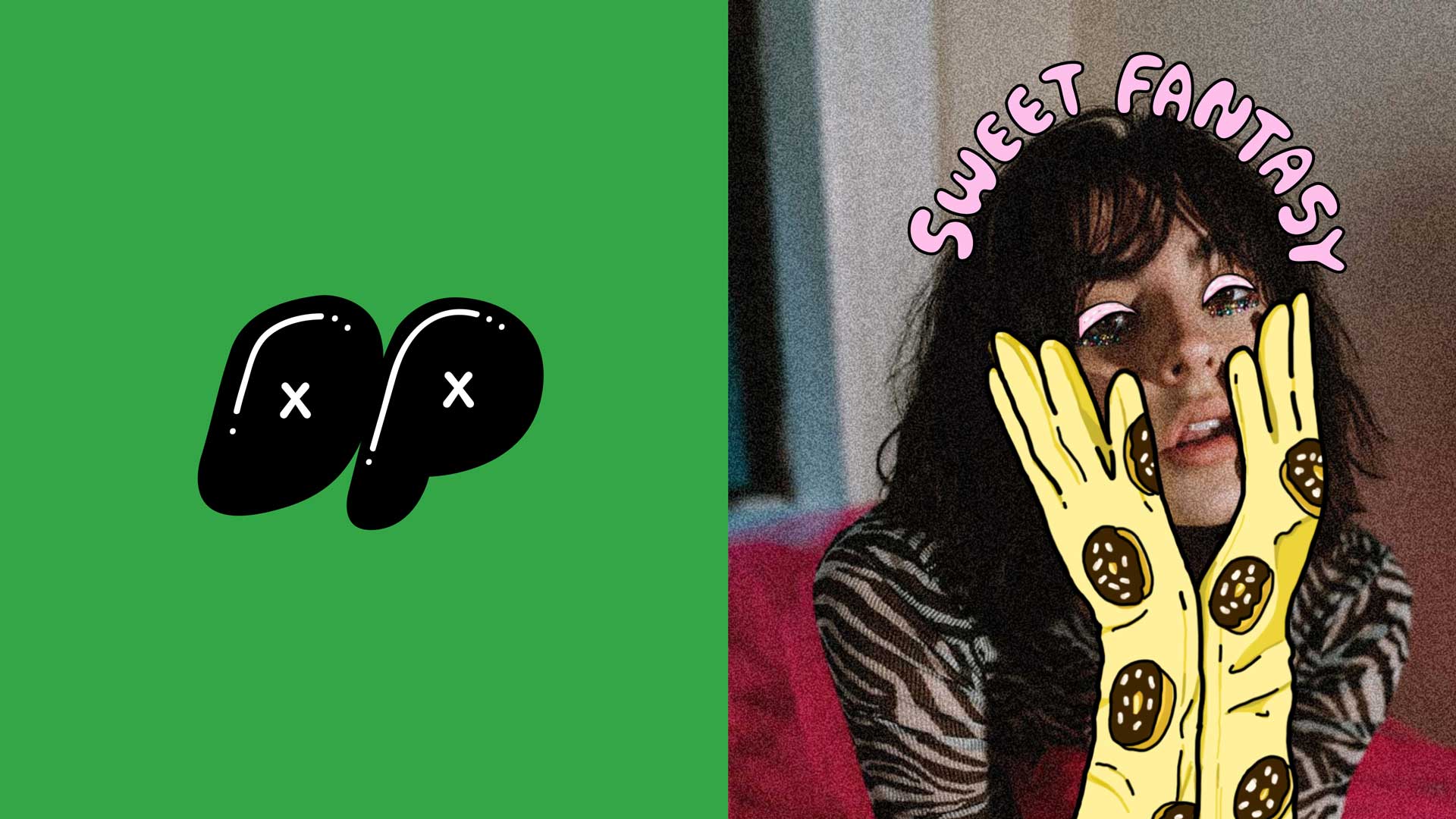
Donut Papi
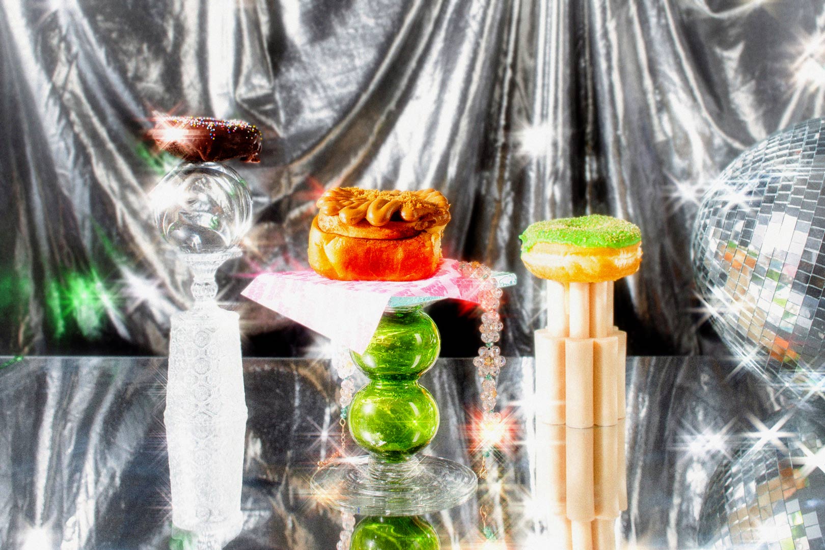
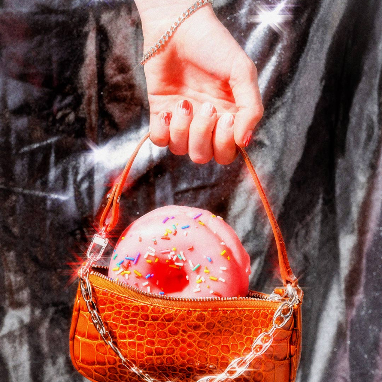
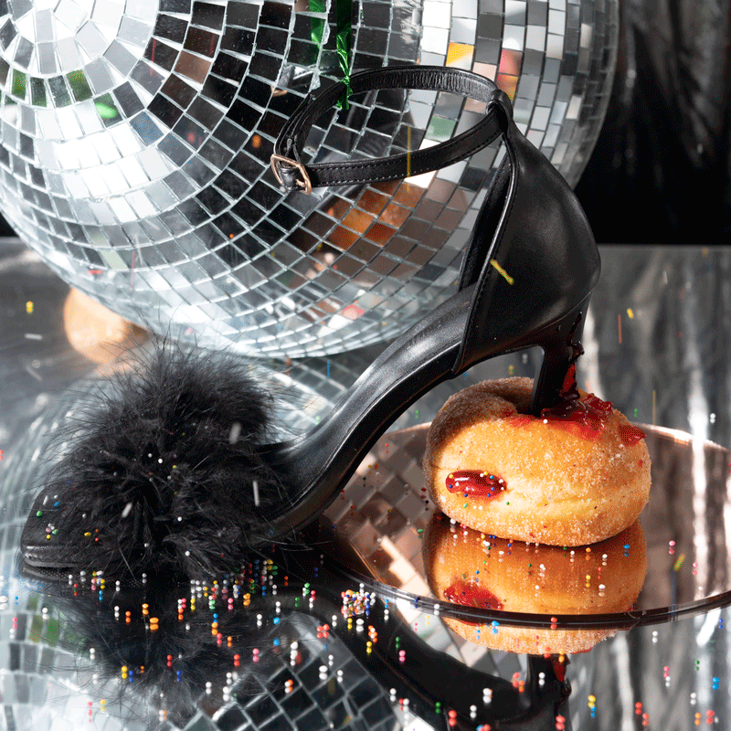
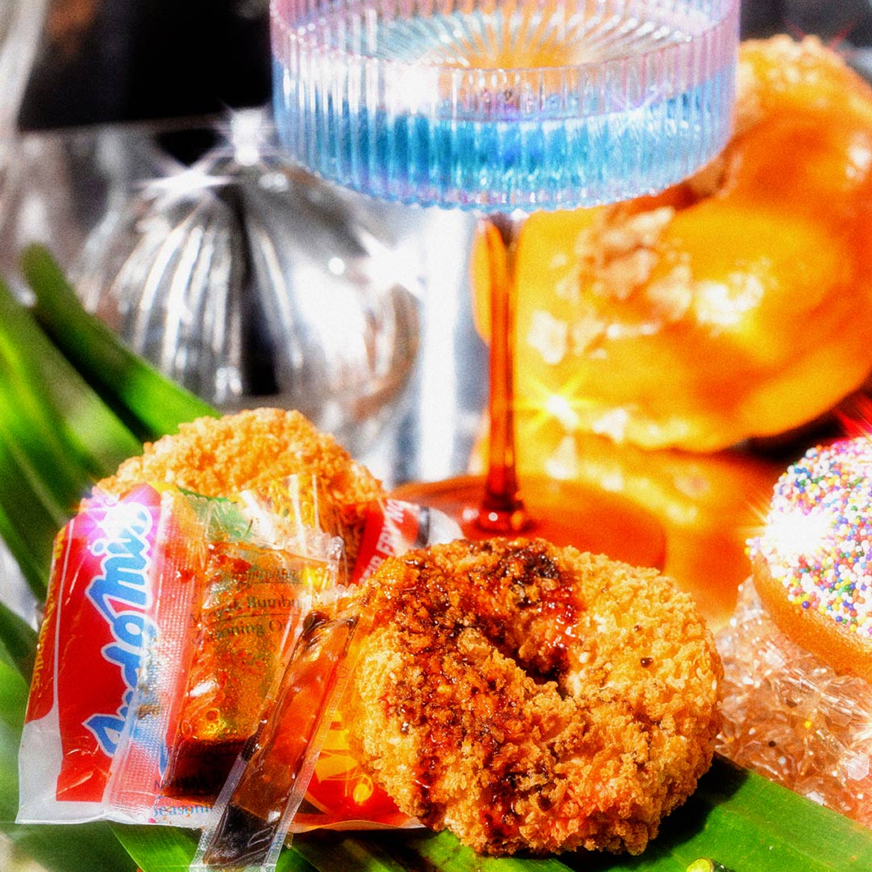
Escape to your sweetest fantasy.
Rebrand and campaign for Donut Papi—Sydney’s cult-favourite donut shop with an Asian twist.
With a loyal following and growing momentum, Donut Papi approached us for a brand refresh to elevate their identity and set the stage for the next chapter. We helped refine their visual language and campaign strategy to match the bold, playful spirit of their creations.
Featured on
Scope
Strategy
Rebrand Strategy
Audience Analysis
Voice & Messaging
Social Media Strategy
Branding
Brand Identity System
Collateral Design
Illustration + Motion
Copywriting
Website Design + Dev
Campaign
Creative Direction
Messaging
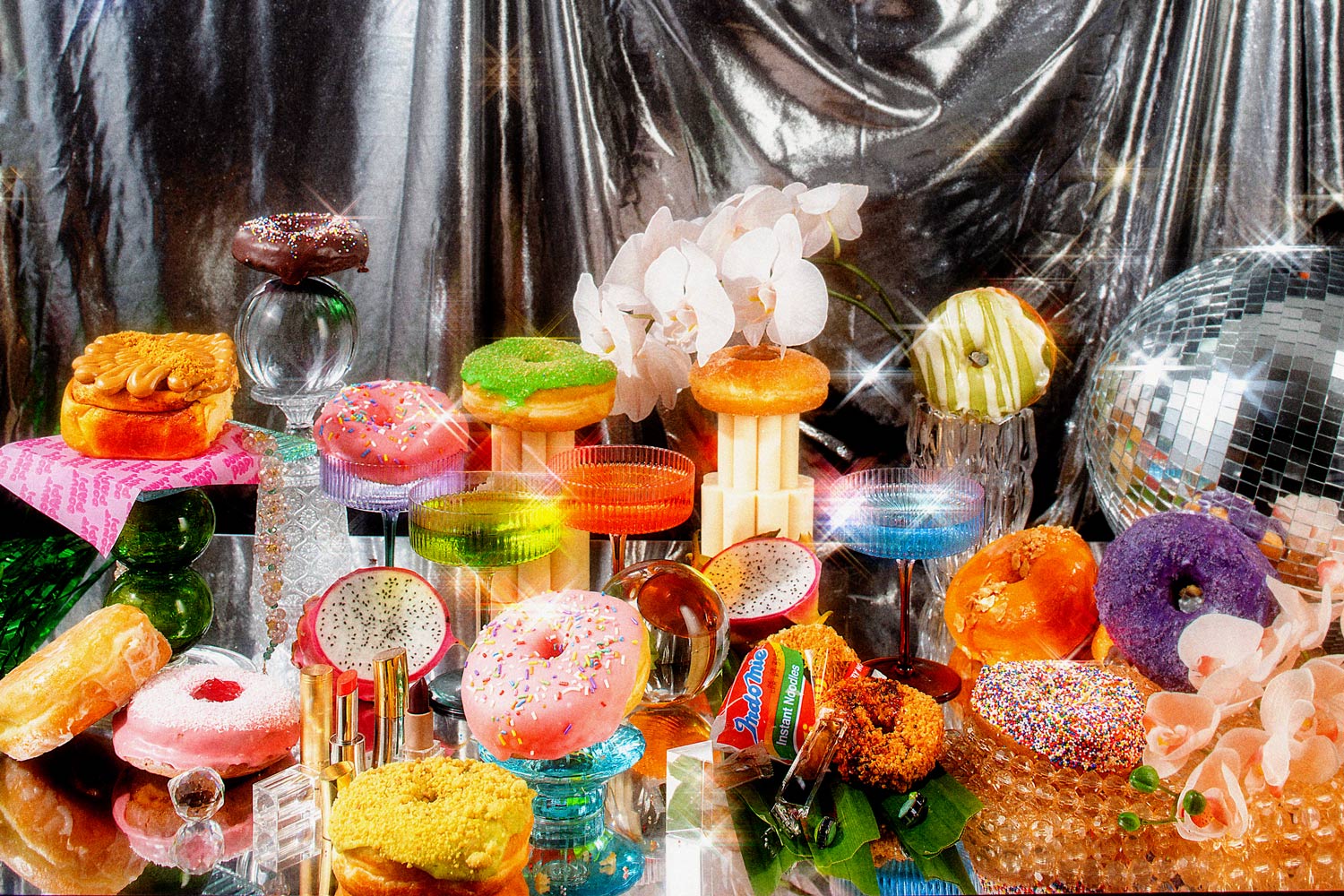
Photoshoot
Social Media Campaign
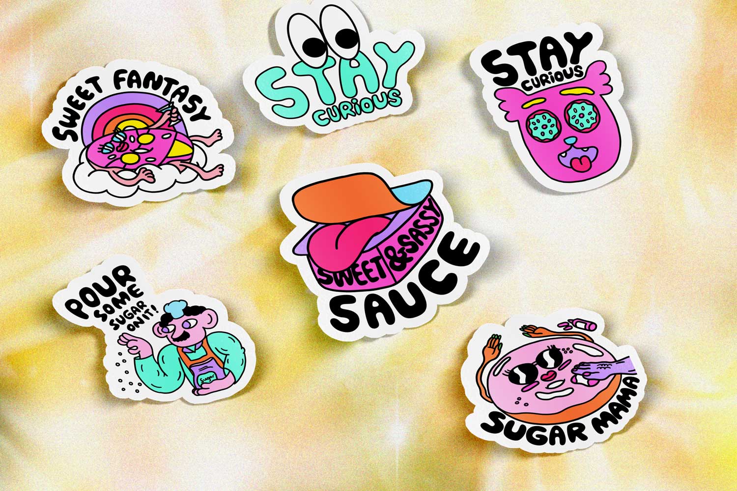
Welcome to the fantastical world of Papi; it’s a cheeky landscape of cartoonish Asian aesthetics complemented with a subtle and nostalgic Australian lens. It’s Jeff Koons in sugar meets Keith Haring–esque cartoons. It’s art that’s laced with sugar.
Our brand audit and strategy process identified the elements of Donut Papi’s existing personality, TOV and brand assets that were working well. We identified a central TOV and personality, and a core narrative for the business.
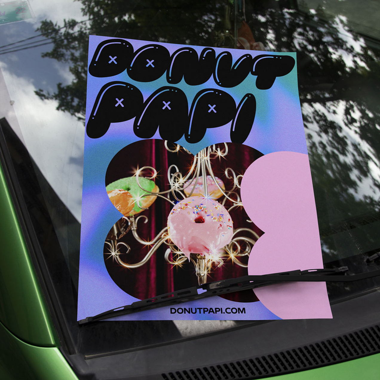
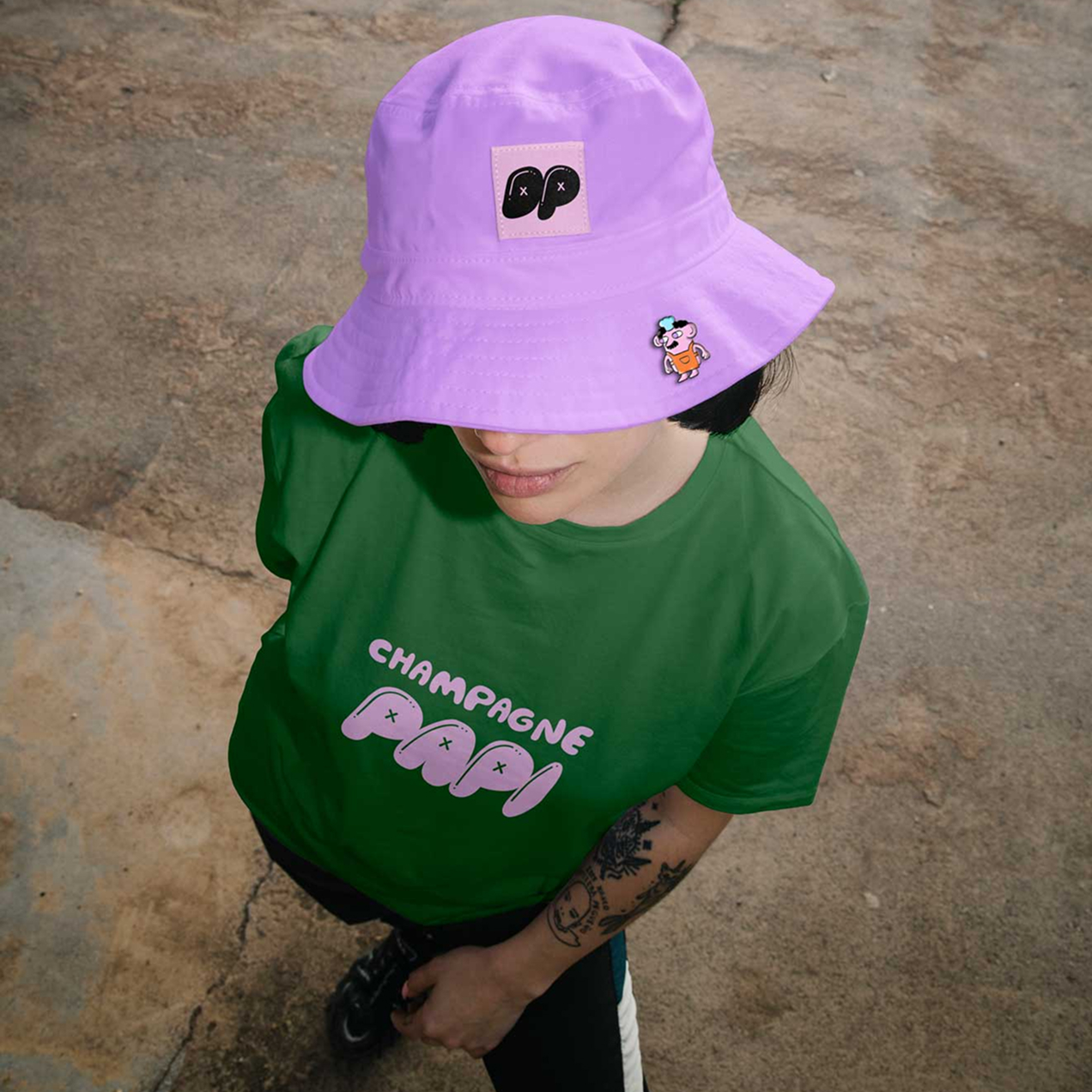
Activation through digital, print, and campaigns
The brand system works like scaffolding; a flexible visual language that transports us into a blurred House of Papi. Cartoons come to life through GIFs, while Instagram filters and frames enable UGC. A new set of brand merch and a new website complements this transition and shows how the system comes together.